|
catch ya clean by bypass [web]
[nfo]
|
||||||||||||||
|---|---|---|---|---|---|---|---|---|---|---|---|---|---|---|

|
|
|||||||||||||
|
popularity : 66% |
|||||||||||||
alltime top: #4658 |
||||||||||||||
|
||||||||||||||
| added on the 2001-07-21 20:21:41 by bhead |
||||||||||||||
popularity helper
comments
Cheekily borrows styles from previous SE entries and gets away with it smoothly. Good show.
rulez added on the 2001-07-22 16:03:12 by Shifter 
Doesnt work
quite okay, although that light-box is a little Purple :)
I get a kernel32 error in Win ME.
for the final version, PLEASE use something better than a box filter to generate your mipmaps, box filters suck with lines...
Great intro.
I liked the "screen-split" part.
I liked the "screen-split" part.
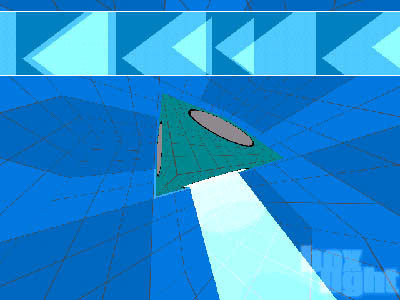
isn't that the wrong screenshot?
not bad ... seen the effects already, but they were arranged in a pleasant manner :)
btw, _i_ invented particle storm ;) (see prod #744)
btw, _i_ invented particle storm ;) (see prod #744)
DAMN .. YOUR CODE IS FAWKING MEGABLAHSTAH! : )
Flash or so?
Flash or so?
i give you positive comments and you get mad? youre wierd
Good sync... still don't like flat cubes though ;)
I like the simple geometric designs. Makes a nice change from more 'normal' productions.
Not bad not bad... just a vote
I like the simple-geometry- with-some-stylish-colours design. Music is pretty good.
nice track by prattie, runs fast on my machine, nice sync ... but thoese coluors... urg :)
it's simple, fast, has an ok tune to dictate the tempo and the color scheme is bearable.
I like it. (my comp is assembled of the items mentioned in the 'has been tested on' list)
I like it. (my comp is assembled of the items mentioned in the 'has been tested on' list)
works well with good sync on my computer. haven't tried it yet with 2k used it first with 98. the music is above average, and the text that accompanies the effects, interestingly enough, just explains the effects used explicitly. interesting to see what happens with bypass.
fast, great design and superb soundtrack!
nothing new but its decently put together
Well done intro, nothing to complain :)
simple design grew on me as the demo progressed. Nice music too
i like diz intro !
enjoyed it !
I dont like diz intro
No
yes
screenshot doesn't do this justice. great idm-flavored drum 'n bass tune that matches the actionally perfectly. fresh style. cool geometry. design just kicks ass. the final scene is great. and the colors are pretty.
Ugly font but otherwise nice.
*Great* track by p-rat, and fresh design/colors. Definitely worth checking out!
Bypass (eye)candy \o/
very boring, and i don't like this ...
not bad at all... but not very good either.
the "lightbox" stuff and the endpart worked, however.
the "lightbox" stuff and the endpart worked, however.
Great intro.
P-rat is rocks as usual and the intro design is original. Nice synching.
rewlers!
Simple and efficient design and appealing music.
prod needs more thumbs
for the music
for the memories.
minimalist nu-school intro with a killer-track by p-rat <3
I've see better in 2k1. The track is nice though.
All objects are spinning wild, and suffers from a "in your face" mode
Nice
meh
lists containing this prod
submit changes
if this prod is a fake, some info is false or the download link is broken,
do not post about it in the comments, it will get lost.
instead, click here !
