|
Museum of Memories by yx [web]
[nfo]
|
||||||||||||||
|---|---|---|---|---|---|---|---|---|---|---|---|---|---|---|

|
|
|||||||||||||
|
popularity : 64% |
|||||||||||||
alltime top: #4517 |
|
|||||||||||||
|
||||||||||||||
| added on the 2023-04-09 16:55:36 by yx |
||||||||||||||
popularity helper
comments
mind blown
rulez added on the 2023-04-09 16:59:11 by blackle 
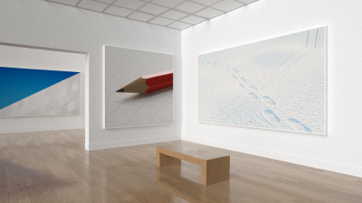
Extremely cool. The idea to combine and present previous works in such a way that makes sense is clever, and the execution is perfect.
Very nice
So how much effort would it be to make this interactive, like a modern version of an artpack? :)
wtf
Excellent idea, perfectly executed :)!!
3-4 entries in one nice idea
Oh my
how much prods there is in an actual prod, huh? well executed!
so good I forgot the actual thumbs up
Cool idea and execution.
4 x 4k now in one ? Compression wizwardy!
Awesome++
Clean.
got me "wow what how"-ing
my party reaction was "ohhhhhh". salute to the director of the exegfx museum
Fantastic entry as ever. Now I'm imagining an interactive https://executable.graphics/.
The ceiling? Oh wow, nice!
The ceiling? Oh wow, nice!
Four for the price of one
Awesome concept. I wonder how you managed to fit in all that :D
great idea to reuse your older work in an interesting and cheeky way :D
Sooo many little details!
so clean, so much to find out!
This is such a humble flex. Understated genius.
Proof that the lion's share of your code is not in the scenes or the textures. But I'd already have guessed that, given that your style is "simple and clean", not "tech show-off" :)
are you planning to upload your code to Shadertoy this time as well? :)
norm
:)
Clean, beautiful, and so much attention to detail
nice & clean, yet feels a tad too much like just an exercise in compression at the expense of everything else. after the initial surprise wears off, i don't feel there's much left here beyond that. but hey, it worked for the compo, and we're all allowed to indulge every now and then; if your existing stuff is already compact enough for this, then why not just show off :)
Excellent! :D
Very impressive.
Very nice, although the framing is bugging me; specifically, it looks odd to me that the picture on the left is cut off, and I would imagine it would look more natural had the camera been pointed more in that direction. Sounds like a minor thing yet I'm distracted every time I look at it. Apart from that tho, I also agree some indulgence is more than welcome and this was really fun to see in the compo!
Just a pleasure to look at!
Very nice!
Great
Prodception!
It's a clever perspective and it seems to pack extremely well. Nice idea, well executed!
The earlier works presented were great on their own right. This is just nuts.
Awesome!
Forgot to thumb this one up. Very well done packing that all in there. 😀
Very clean, very polished and stylish, too!
Crazy cool!
Nice archi
yes
submit changes
if this prod is a fake, some info is false or the download link is broken,
do not post about it in the comments, it will get lost.
instead, click here !
