| Silent Winds by V-Nom | ||||||||||||||
|---|---|---|---|---|---|---|---|---|---|---|---|---|---|---|

|
|
|||||||||||||
|
popularity : 57% |
|||||||||||||
alltime top: #21350 |
|
|||||||||||||
|
||||||||||||||
| added on the 2017-08-07 00:38:52 by bonefish |
||||||||||||||
popularity helper
comments
was so so on the stream.
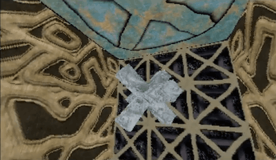
Textures could do with some work, music is quite weak, fixed point transformation precision is too low. Still, piggie for the effort and improvement.
The 3d is quite OK but the low-precision and wobbly textures look pretty bad. Music is a mixed bag but not that bad. Piggie for the effort indeed.
Some suggestions for your next demo:
- better looking textures and a much more precise texture mapper; also add some perspective correction
- less boring presentation of the 3d scenes
- some other effects than just 3d scenes :)
Some suggestions for your next demo:
- better looking textures and a much more precise texture mapper; also add some perspective correction
- less boring presentation of the 3d scenes
- some other effects than just 3d scenes :)
looks and sounds like crap :(
Eye-cancerish textures meet okayish music and a 3d-routine....but it's Amiiigaaaaaaah...so a weak piggie mainly for the nice greeting scroll inside the 3d
Motivational thumb
Nice prod, I understand there a is a lot of work behind it.
Nice scenes, music not.
Btw this doesn't really work on my a1200. The scrolling backgrounds have a stripe with noise. The tunnel with propeller is broken (some black stuff on the screen instead of the propeller and missing polygons) and most scenes after that except for the landscape. Hangs in the scene with the character in the middle.
Wish it was silent and not ugly which it was.
Even 90's would have aborted this baby.
Even 90's would have aborted this baby.
Not so bad ! Best amiga demo on assembly 2017 !
On my A1260 running good without mistakes...
With better music and some better textures (from the "character in the middle" part it was horrible), maybe some lights and the demo will be rulez...
On my A1260 running good without mistakes...
With better music and some better textures (from the "character in the middle" part it was horrible), maybe some lights and the demo will be rulez...
actually a pretty solid effort!
i second what was said about the accuracy of the 3d, but this is something you can fix for your next release without too much effort, probably.
Except this you have all the required code to do nice demos (adding some lighting code would be nice, though).
one more tip regarding textures:
if your engine doesn't support lighing, try to incorporate some darkening into your textures (for example in corners). using textures where everything is equally lit/bright doesn't look good without realtime lights.
looking forward to your next demo (hopefully doesn't take several years) :)
Last prod - the best!
dull
Maybe it's not a great demo, but I like it.
i like the music, nice 3D-show, almost 5 minutes running time
submit changes
if this prod is a fake, some info is false or the download link is broken,
do not post about it in the comments, it will get lost.
instead, click here !

- The textures look bad and they wobble.
- The objects are buggy and shaky.
- The whole thing is a pointless flyby and object show.
Recruit a graphician, it'd do a lot of good.