|
Axiom by Futuris [web]
[nfo]
|
||||||||||||||
|---|---|---|---|---|---|---|---|---|---|---|---|---|---|---|

|
|
|||||||||||||
|
popularity : 61% |
|||||||||||||
alltime top: #10744 |
|
|||||||||||||
| added on the 2015-09-07 15:57:11 by wysiwtf |
||||||||||||||
popularity helper
comments
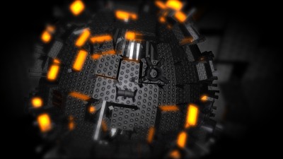
the "lego normal map" kinda ruins the mesh, but nice little demo
rulez added on the 2015-09-07 16:06:15 by maalinstrippari 
Odd package. Some of the graphics look nice but then other bits have painfully stretched UV, the music isn't bad but doesn't exactly blow me away with originality, and the direction is just veeeery 90s.
Loved it.
does remind me of this only with harder edges ;P
The music was good, the endless zoomer in the end was epic - have your thumb.
The music was good, the endless zoomer in the end was epic - have your thumb.
the sucker crashes herre. video/yt please? :)
Nice one! It was fun to watch. :)
oh i just did a hd capture with shadowplay and am uploading to yt as we speak.
but if you want to supply a (probably kkaptured) video i will not add the link.
but if you want to supply a (probably kkaptured) video i will not add the link.
Gargaj makes some good points but overall I liked it. Greetings part works really well.
One object to rule them all! I love 90's demo style :)
nice!
lego!
Great! Gratz.
I like how fragile and somehow physical the sphere things feel, but combined with the music this doesn't work as a demo for me. It's way too static and clean for my taste.
Like it...would have rules with proper Uv / textures
I appreciate the classic demostyle aesthetic and the fact that you squeezed a full demo out of a single primitive object. Many people seem to lack the confidence to explore an effect in full.
However, I would've liked some more advanced shading - a simple microfacet model goes a long way - with real progression and closure.
Bonus points for the pretty fonts and long zoomers :)
However, I would've liked some more advanced shading - a simple microfacet model goes a long way - with real progression and closure.
Bonus points for the pretty fonts and long zoomers :)
It really rocked during the compo. Well done!
you need more than a reese to win..
1st
well..fuck me
1st
well..fuck me
The concept is not bad if shaded better - reasons mentioned already, especially strange texture stretching, but also overall polygon feeling.
That's too bad, since it would be nice and even original contribution to inifinite 3d zoom effects,e.g. fr-043: rove around 5:20, Noumenon etc...
Synchronization could have been a bit better as well, for example around 1:21 I don't really feel the base in animation, but in general it's not bad.
That's too bad, since it would be nice and even original contribution to inifinite 3d zoom effects,e.g. fr-043: rove around 5:20, Noumenon etc...
Synchronization could have been a bit better as well, for example around 1:21 I don't really feel the base in animation, but in general it's not bad.
Nice!
O_o--b
O_o--b
..............
nice visuals, but that bassline :-/
i liked it until the infinite zoom part ruined it :/
niceish
submit changes
if this prod is a fake, some info is false or the download link is broken,
do not post about it in the comments, it will get lost.
instead, click here !
