|
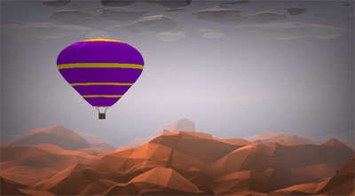
Air on a Polygon by Rift
[nfo]
|
||||||||||||||
|---|---|---|---|---|---|---|---|---|---|---|---|---|---|---|

|
|
|||||||||||||
|
popularity : 59% |
|||||||||||||
alltime top: #11029 |
|
|||||||||||||
| added on the 2016-08-14 19:28:07 by Fell |
||||||||||||||
popularity helper
comments
Loved it guys! We should do this again some time :D
rulez added on the 2016-08-14 20:03:31 by TropicalTrevor 
It was a hilarious moment at the party when you guys and myself realised both groups chose the same concept. This kind of group interaction is awesome. As for the demo, it's great. Thanks for telling me how the 'low poly' look was achieved when I was too drunk to figure it out. Keep making more!
Love these compos-within-compos, and nice contribution as well!
okish. if only soundtrack was better than just a rip. you need a musician.
thumb up for best relaxing evoke intro.
thumb up for best relaxing evoke intro.
:)
I like the raymarched (right?) polygonal look :)
Was great!
Tigrou, did you just call an interpretation of a classical tune a "rip"? o.O
Overall enjoyable, shame about the artifacting.
What kb said. The lighting looks way too bleak for Bach's Air imo. Otherwise enjoyable though nothing earth shattering.
your balloon looks better but your terrain looks worse. i'd say, combine the code in a merged final! ;P
Really liked it. I love the shading! Looks so damn sweet :)
A bag of publicly available resources used in an interesting way.
(spoiler alert) I loved the island/water scene near the end.
Overall, not bad at all.
(spoiler alert) I loved the island/water scene near the end.
Overall, not bad at all.
I have to say I laughed my ass off when I saw what you guys came up with. What are the odds of us picking the same general theme? Well, the geometry of balloons might play a significant part, but other than that, I think it was simply fantastic to battle you guys. We should definitely do this again sometime. Also, as I already mentioned: yours had all the elements while ours lacked water and fire. I haven't got the insights of all the magic under the hood, but it sure as hell looked great and I particularly liked how the clouds behaved (is that the correct term!?) as the balloons rose up through them. On the musical side, picking "Air" was really great, and the implementation was just beautiful. Hats off for pulling this off in such short time and I'm really looking forward to our next challenge! Because there will be one, right? And why not include some more? Having a bunch of prods interpreting the same theme could be a really interesting twist in times where pretty much all technical stuff gets more and more comon. When engines and tools are perfected and shadertoy provides inspiration to an extend that's getting ridiculous, we should move on to compete on other artistic aspects, like interpreting a given theme or concept. SO, on behalf of Poo-Brainque, I hereby challenge Rift and other 4k coders that would like to join in on the fun, to interpret the theme "Vikings" for the 4k compo at TRSAC!
What the ... how is that coincidence even possible?! I wouldn't like to decide who did it better ;) Anyway, thumbs!
Okay.
I think it was one of my favourite productions among all compo. That was beautiful, thank you :).
I think it is really cool that you guys did an unofficial themed competition between groups. Sometimes it can be hard when you are forced to work with a fixed concept but both groups came up with a great result.
loved this. very nice look and that coincidence... :D
Video please!
would have been ace if the binary fire was replaced with something visually more fitting
submit changes
if this prod is a fake, some info is false or the download link is broken,
do not post about it in the comments, it will get lost.
instead, click here !
