|
They called it by Public Service Announcement
[nfo]
|
||||||||||||||||
|---|---|---|---|---|---|---|---|---|---|---|---|---|---|---|---|---|

|
|
|||||||||||||||
|
popularity : 62% |
|||||||||||||||
alltime top: #8178 |
|
|||||||||||||||
| added on the 2016-08-14 12:39:22 by urs |
||||||||||||||||
popularity helper
comments
worship the cube!
rulez added on the 2016-08-14 12:56:05 by elfh 
Very nice! I was expecting “mercury” to show up while the compo and was astonished not to see it. Now I understand. :)
Doesn't work on this PC. The last thing I get to see is the cube (loading screen).
+ Sweet track
+ Sweet art
- Don't think it ran correctly? Gotta check.
- I always cringe a bit when I see the word "demoscene" in a prod.
- Put my desktop resolution back when you exit? Please?
+ Sweet art
- Don't think it ran correctly? Gotta check.
- I always cringe a bit when I see the word "demoscene" in a prod.
- Put my desktop resolution back when you exit? Please?
not sure about that one. okay, it is an invitro but still. i'll pigg it :)
nice prod
it's really cool, except for the obnoxious pseudo-graff font.
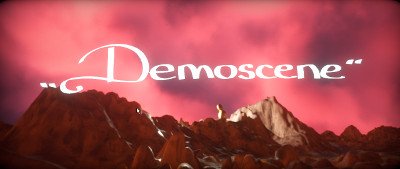
That 2d-artwork was very very very nice. Also I like the pyramid effect a lot. The font was a bit...uuuh. As a whole a very production and a very fine invite. Luckily my resolution did got set put back hehe :) Good colors, mood and atmosphere. Thanks!
Nice. Especially the clouds.
Cool scenes and fantastic rendering.
Sets the right mood for the next deadline.
Thumb up for the fact it's an invitation and the concept behind.
Otherwise - I would prefer it to be 64k ;) Landscape looks really cool, but I'm not sure how much of this is actually procedural.
Otherwise - I would prefer it to be 64k ;) Landscape looks really cool, but I'm not sure how much of this is actually procedural.
In many ways the best demo in the compo. Agree with some earlier complaints, mainly about the typeface but I still wasn't too put off even by that. High class rendering, solid inv.
cool invit
Decent tech, horrible font, everything slightly too corny and disconnected.
The style reminds me of 10-12 years old Kewlers and Keyboarders prods but without any of the care and thought those guys put into their stuff.
The style reminds me of 10-12 years old Kewlers and Keyboarders prods but without any of the care and thought those guys put into their stuff.
Pretty much what Korvkiosken said, with 10x the "horrible font" because what the serious hell. :) The track was groovy too, very much a plus.
The invit is very much ok, even more so for such a small event. The typeface as such is rather neat too, but probably not the best choice here, especially when you use it in this in-your-face-fullscreen style fashion.
I didn't see a problem with the font - but who knows, maybe it's because I'm not a font expert :P
Sets a great mood - loved the track and clouds.
Sets a great mood - loved the track and clouds.
track was very good
cool one
Very clean invitation.
Mission accomplished :)
Don´t get the fuzz about the font - it did its job well, is unique and thus still way better than the most common "standard system font" approach
Don´t get the fuzz about the font - it did its job well, is unique and thus still way better than the most common "standard system font" approach
does the job
prima
wait, I haven't commented on this yet? It's one of my favourite Deadline invitiations - love the vibe of it and I'm still grateful to the mercury peeps for doing this on the party. I like the blinking pyramid best
lists containing this prod
submit changes
if this prod is a fake, some info is false or the download link is broken,
do not post about it in the comments, it will get lost.
instead, click here !
