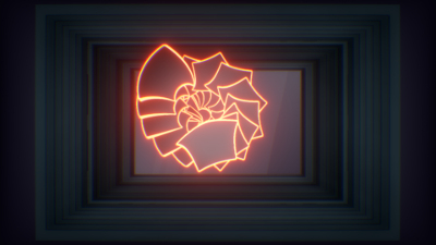
|
f8:5 by Rtificial [web]
[nfo]
|
||||||||||||||||
|---|---|---|---|---|---|---|---|---|---|---|---|---|---|---|---|---|

|
|
|||||||||||||||
|
popularity : 67% |
|||||||||||||||
alltime top: #2728 |
|
|||||||||||||||
| added on the 2016-03-27 01:42:19 by Ps0ke |
||||||||||||||||
popularity helper
comments
This is really awesome. Great style!
rulez added on the 2016-03-27 01:43:15 by gaspode 
pretty decent
Yes, definitely liked this one. Neon!
Nice!
this was cool ... and 16k even!
:)
Really great concept and visual style, well executed. Flow/transitions are perfect.
fun stuff :)
Nice!
Lauta!
Very nice idea!
This was awesome, my jaw dropped when it turned out to be fnc invitation! Great piece of an artwork!
Really like!
nice
That style!
intereesting... I had to adjust to the style, but it kind of worked for me, i guess.
aHA! so it wasn't 16k after all :P still thumb ;)
Very cool1
Awesome pseudo-2D composition style. I liked how it evolves so that it seems kind of simple in the beginning but keeps on getting cooler and cooler.
Awesome ! Great idea & nice execution
Refreshing
What drift said! You're definitely evolving, and I'm really looking forward to what you come up next with.
The "invitation" part felt totally out of place though.
The "invitation" part felt totally out of place though.
Sweet effects!
Some effects are very cool, others not! You should have kept only some of the FXs... But nice anyway!
Nice use of feedback!
Just plainly awesome.
Refreshing. Nice idea and nice execution.
that was amazing. it has everything: a fresh idea, nice execution, just the right length, fitting soundtrack. Makes me want to go to function. I don't get why it ended up only fourth... by 5 votes.
"some fucker didn't vote"
"some fucker didn't vote"
fresh!
... wait, it was an invitation? Cool stuff nevertheless!
Instant love!
nice flow. i enjoyed it :)
First half and last thirty seconds.. fresh, different and great. The middle part with the plane where it all seemed to go a bit cheesy retro kinda ruined it for me though :(
Not really much of an invitation at all but a nice intro. The middle part was way too long for me though. The rest was really enjoyable, music fits nicely too.
Fresh and fun! I loved its tactile handmade look.
Great work guys. Was cool chatting with you on Sunday and hearing the story of the use of two synths synchronised!!
Nice effects & transition, original Music. Good Prod !
Nothing not to like
The only thing I can say: thank you, thank you, thank you!
Had some slightly awkward parts but as a whole, really nice visuals.
Reeeeeeeally good looking and convincing vector display emulator... made the bigscreen look like a massive Vectrex. Adored the awesome hybrid look of the renderer, and a lovely tune as well!
@cupe DO come man!
Cool! I have been playing around with similar layering idea but never got myself into coding it, so it's nice to see it done. And especially done well, fitted in 64k, looking awesome, and go beyond what I imagined! Great work! :)
great stuff.
i would give it a thumb alone for the weird idea of using 4klang AND v2 in the same production :D
i would give it a thumb alone for the weird idea of using 4klang AND v2 in the same production :D
Fresh visuals, the music could have been better.
Makes me want to go to Function!... Err, wait... :)
simply rulz
stylish
really fresh!
This puts parts that are very stylish right next to cheesy ones.
Also, plane bombing a city, September 9-11. What did you do here? :->
Also, plane bombing a city, September 9-11. What did you do here? :->
Nice
Wow. :)
weird, somewhat unfinished, different
way underrated 😍
submit changes
if this prod is a fake, some info is false or the download link is broken,
do not post about it in the comments, it will get lost.
instead, click here !
