|
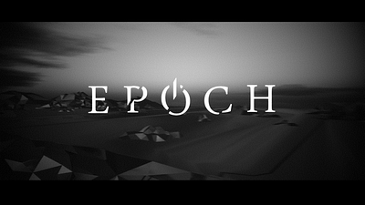
Epoch by Epoch [web]
[nfo]
|
||||||||||||||
|---|---|---|---|---|---|---|---|---|---|---|---|---|---|---|

|
|
|||||||||||||
|
popularity : 66% |
|||||||||||||
alltime top: #4434 |
|
|||||||||||||
| added on the 2014-05-18 04:04:44 by noby |
||||||||||||||
popularity helper
comments
looks promising but wont run well on my GTS 450
added on the 2014-05-18 04:23:34 by laz33rr 
nice. makes me wanna replay Bridge Project :D
also i expected the story line to be like when the truck is full with oil, it would go over the bridge again and then it would break!
also i expected the story line to be like when the truck is full with oil, it would go over the bridge again and then it would break!
the visuals couldnt always live up to the epic pace and (quite awesome) soundtrack, also it was maybe a tad too long in the end...
i enjoyed wathing this tho, the turning-on-colors thing was a nice twist.
i enjoyed wathing this tho, the turning-on-colors thing was a nice twist.
a bit too long but very moody. good music. thump up :)
dubtech and a bit weird direction :)
good's
massive shit
More Dubtechno demos! Fantastique.
I really loved the look and feel of this. Great atmosphere.
Design / direction is a bit lacking, and the demo suffers from general "emptiness", but I'll let it slide considering the small amount of time the Epoch guys had to actually do all the syncs.
Should've placed second.
Design / direction is a bit lacking, and the demo suffers from general "emptiness", but I'll let it slide considering the small amount of time the Epoch guys had to actually do all the syncs.
Should've placed second.
This works really well and I enjoy chilly track. The plot twist was fitting.
nice but something left to be good enough, a bit slow tempo to captivate
Great atmosphere.
I really enjoyed the first minute, it was very well done on all the departements (visuals/music/direction).
Then I think it's a too empty for the length, but the colourchanges were nice enough to keep me in.
Good job.
I really enjoyed the first minute, it was very well done on all the departements (visuals/music/direction).
Then I think it's a too empty for the length, but the colourchanges were nice enough to keep me in.
Good job.
What uncle-x said. Great music and great atmosphere.
I loved the atmosphere, rendering and music. Definitely low on content for its length though. Maybe this could've used even more slow and lingering camera work. Often when you cut quickly to a different angle I was expecting something new to be presented, and usually there wasn't. Anyway, good work. Looking forward to more.
I like how there are two peps credited for "direction", although there's hardly any in it. :) Nice visuals though.
There is certainly solid above-average direction.
My big issue is that it builds effectively but the tradeoff is a bit lackluster: the colors kicking in is a great moment, but then the truck just sortof stands there and that kinda kills the anticipation. Again, not a problem in direction, but certainly a problem in script.
The visuals work for the most part although the large empty reflecting planes kinda make the models feel like they're floating - especially in the last shot.
^
good stuff
The rendering with mixed Edge-Toon/Reflection/Rainbow is very nice. This 3d world is interresting. Presented for the first time ever using a new Static fly-by concept (joke, but that was a little too paced for me). Was wondering if it is possble to do a remix with brutal bass music and fast ride around this 3D world , that could rocks as well.
Great design, loved the music..
great stuff! I love the edge-enhanced environment-mapped material strangeness on everything. Instead of trying to look realistic, you manage to give things a very distinctive look.
yespls
Visually quite pleasing, but ultimately too boring!? It builds up a tension, which it can't really pay off in the end. :/
nice!
...........
What uncle-x said.
"... is not a valid Win32 application." with an old, updated Windows XP Pro. SP3 machine with an ATI Radeon 4870 video card (512 MB of VRAM)? :(
Anyways, nod bad on YouTube. :)
Anyways, nod bad on YouTube. :)
You didn't miss much, the HD4870 (GPU soulbrothers, high five!) renders this at 1 or 2 frames per second.
Which is pretty weird since the graphics shouldn't be that demanding!
Which is pretty weird since the graphics shouldn't be that demanding!
Cool work with (and without) colors, great music.
Great!
1 fps on a GTX470 / Q9650@4,4 Ghz, which is the slowest realtime 3D performance of any application ever run on this hardware at 1920x1080.
judging from the youtube video, i really can't see why that should be the case...
judging from the youtube video, i really can't see why that should be the case...
almost bored me to death
5 minutes of pure boredom.
great atmosphere, the sudden color splashes are very effective and add a stylish note. can't argue that the whole thing might appear boring to others, but i'm not others =)
only #3? should have won!
A bit boring on the content side but looks and sounds rather nice, so thumbs up :)
And suddenly, there were colours.
awesome
no chance for a final with res-selector?
elsewhat pretty unwatchable on my dusty GTX470 :c
elsewhat pretty unwatchable on my dusty GTX470 :c
weak thumb up
Music is awesome of course. I like the visual style, simple but effective and I think it suits the music. The flashes of colour earlier on were a nice tease and it kept me waiting for when all the colour would come in.
The colours are oversaturated for sure but I assumed that was deliberate as a strong contrast to the monochromatic start. Either way it works for me.
Always cool to read a bit of backstory on demos or any artistic work really.
Always cool to read a bit of backstory on demos or any artistic work really.
what the...? how were you able to do something like this in your first prod on a new setup? amazing.
Fade to black transitions are tiring.
Rules of course. (Another how I didnt comment before)
lists containing this prod
submit changes
if this prod is a fake, some info is false or the download link is broken,
do not post about it in the comments, it will get lost.
instead, click here !
