|
Ignition by Division
[nfo]
|
||||||||||||||
|---|---|---|---|---|---|---|---|---|---|---|---|---|---|---|

|
|
|||||||||||||
|
popularity : 65% |
|||||||||||||
alltime top: #5407 |
|
|||||||||||||
|
||||||||||||||
| added on the 2013-08-04 23:09:35 by Bobic |
||||||||||||||
popularity helper
comments
:)
rulez added on the 2013-08-04 23:11:00 by CHEF-KOCH 
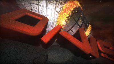
For me Division is one of the most underrated groups, something like the "coup de couer" for (PC) groups. Hedron was a perfect demo. Ignition isn't, but the opening sequence with the big letter logo and the burning Zeppelin in the background is simply awesome. And so is the music. Well done!
Yeah the opening scene was very nice!
Division is also for me one of the hidden promising groups (since the first time I saw Chasm and their next demos). This one has some good moments and interesting effects, though the constant broken screen effect per beat of music spoils it a bit.
Way better than the pyrotech demo.
what las said
i prefer hedron too, tho
i prefer hedron too, tho
Deffo one of the compo highlights for me, but as was said before the constant noise effect per beat is a bit too persistent. Still, visually impressive with a stunning soundtrack and even some sort of storyline, excellent work!
good prod. love the music!
Visually a mixed bag, with cool stuff (especially that second scene with the logo build-up) as well as some quite ugly and messy scenes. Nice soundtrack. Motivational thumb up, a bit more polishing for the next one and you're there.
Forgot the thumb, Here you go.
This one was great to watch, too. This and the reflexion by adapt were my favourites in the demo compo :)
Not as good as some of their earlier prods, but still definite Division quality.
This is a huge mesh in sounds and colors, and it really lacks proper textures, lighting and some serious attention to details. The "particle/dissolve" fx was neat, but not put into any good use imo.
Please remove the screen distortion filter, I'm trying to see what you're hiding.
Hm, this was a little all over the place. That distortion-filter has to go - really annoying. Nice music (despite the Finglish speech at the end), and some cool effects (though hard to see, due to the beforementioned distortion filter), but way better than the winning demo.
PS: what do you guys have against Africa? :)
PS: what do you guys have against Africa? :)
A solid prod (visuals & musc), but it leaves the feeling that only little action is happening in nearly 4 minutes.
I liked Hedron more ...
I liked Hedron more ...
We have group policy not to comment in pouet.net, but this one has to be corrected: We do not have anything against Africa, it is just a easily recognizable continent.
Jouni Salo / Division
Jouni Salo / Division
weird
Well done
Cool epic soundtrack (apart from the slightly rallydriver english distorted vocals). Visuals are okay, just lose the distortion thing. Nothing really surprising, but if the mentioned two things were "corrected", it would be a quite good show.
For current state of affairs, I still lean more towards a thumb-up than a piggy, mainly because of the soundtrack.
For current state of affairs, I still lean more towards a thumb-up than a piggy, mainly because of the soundtrack.
Best sound among the top three imho, but still pretty generic. Where's the innovation?
2001 seems to have called you too. And what maytz said.
A bit cheap looking on the color, 3d model and texture department. Music wasn't my taste either but other than that decent.
Solid. Begins more promising than it ends.
what raer said
If it weren't for this incredibly annoying screen distortion filter this demo could very nice in stereoscopic 3D.
Really prommisingly, but why on earth ruin the demo with such an odd distortion filter(thankfully possible to remove with some hacking ;)). The music feels good too.
from top3 assembly demos, this was greatest, and should have won the compo...perfect soundtrack and some scenes (eye)
Rather pompous. I so wanted to reach behind it and pull out some meaning, but there's nothing there. Some effects were quite nice, but as a whole it wasn't really interesting.
ok one
Solid and flows really well! Cube room then text then stars then cube room then text then stars... all synchronized with the pad.
I like your style and evrey single demos you made so far. Keep it up.
and I think it is cool.
ok, but that distortion filter.....
Nice music but rather boring demo. And what's up with that distortion filter which looks very bad and adds nothing to the demo? Should have been left out!
Pros:
1. Good music
2. beautiful, atmospheric introduction
Then style changes suddenly...
Cons:
1. Distortion... why, oh why... It hurts.
2. Airships in space? Srsly? Also, they look bulky.
3. Demo is too short, as intro takes half of it.
1. Good music
2. beautiful, atmospheric introduction
Then style changes suddenly...
Cons:
1. Distortion... why, oh why... It hurts.
2. Airships in space? Srsly? Also, they look bulky.
3. Demo is too short, as intro takes half of it.
Also, poor Niger. :-)
Nice demo with an exceptional soundtrack!
Me likes
Ok. Worth a thumb.
Nice one, liked the Style :)
get some post process bloom here :)
some nice parts
lists containing this prod
submit changes
if this prod is a fake, some info is false or the download link is broken,
do not post about it in the comments, it will get lost.
instead, click here !
