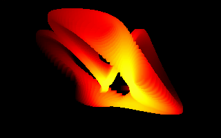
|
ZMORA by Introkreatywne Niskopoziomowe Doznania [web]
[nfo]
|
||||||||
|---|---|---|---|---|---|---|---|---|

|
|
|||||||
|
popularity : 64% |
|||||||
alltime top: #4914 |
|
|||||||
|
||||||||
| added on the 2010-11-08 18:06:35 by Pirx |
||||||||
popularity helper
comments
Nice depth.
awesome
great!
.
Very nice.
Very nice? Only? =)
Great!!! Amazing!
Great!!! Amazing!
Really great one Pirx :-)
Awesome work, Pirx. Keep up the good work!
neat
:)
256b
Firey.
hecka 3d
inspiring :)
cool
You won the demo of the day competition, do you have anything to say, pirx? :P
yay :)
+: Most complex parametric shape I've seen in a 256b (sincos polynomial with heavy use of 2π/3). Good constant/stack usage and palette setting, no dirty hacks.
–: Don't agree with some tradeoffs (dword copying, vwait, textmode, 2 full float constants), those ~20 bytes could be used better.
Very nice overall. ;-)
–: Don't agree with some tradeoffs (dword copying, vwait, textmode, 2 full float constants), those ~20 bytes could be used better.
Very nice overall. ;-)
Love it!
> vwait
I use it only for intros that run too fast on my aging notebook (e.g. uzel had 1% cosines and 17% z-buffered pixels compared to zmora, so it needed vwait).
> On less significant bytes...
I missed those imuls at the end, my mistake. I thought only the first float was overlapped.
I definitely need to try BIOS palette fns and explore Bourke's site.
exotic
it's nice
rulin movement,object and colors!
How are you vidcapping these, anyways?
Great to know, thanks :)
Just got around to seeing this. Nice work, as always :)
hi pirx, i never commented this one.
for me this is a very good intro (technically and visually speaking).
no thumb up since selfvoting is not a good idea otherwise I would have give one for sure.
for me this is a very good intro (technically and visually speaking).
no thumb up since selfvoting is not a good idea otherwise I would have give one for sure.
Nice! and very introcreative name :)
i actually wonder why this did not get more attention o_O
Pirx
Looks great, some angles work better than others, but impressive overall.
Didn't like colors.
Nice
better than any baudsucker prod
both what Sense said =)
Lame revenge thumb down is lame! Intro is cool! :)
Pretty!
The craziest color palette code ever!
yes
submit changes
if this prod is a fake, some info is false or the download link is broken,
do not post about it in the comments, it will get lost.
instead, click here !

looks neat, nice colors, and 256 bytez!