|
Dralowln by Satori [web]
[nfo]
|
||||||||||||||
|---|---|---|---|---|---|---|---|---|---|---|---|---|---|---|

|
|
|||||||||||||
|
popularity : 64% |
|||||||||||||
alltime top: #7247 |
||||||||||||||
|
||||||||||||||
| added on the 2010-10-23 23:55:25 by zden |
||||||||||||||
popularity helper
comments
mysterious.
rulez added on the 2010-10-24 00:10:51 by wysiwtf 
kinda meh, too long and not a whole lot happens.
Yes
Nice scene.
It takes courage to make a demo that's so focused on the moment. Also, it's gorgeous in its surreality.
Didn't grab me in the same way other Satori stuff does, and not his usual style but I guess that's why it's in the think different day, whatever that is.
Not a fan of the lighthouse.
Not a fan of the lighthouse.
I enjoyed the mood of it, but it didn't really have anything more for me than that.
super nice, very good fit between musi and visuals, sweet mood.
It fucked up here. Probaly a compatibilty issue. You need to get a proper coding attitude. ;)
where is #000000
relaxing :)
boring the fuck
I REALLY liked the beginning, but past that it didn't really show anything. Plus I don't think the scene with the lighthouse looks good at all.
the liquid effect is nice and dreamy, but watching 3 minutes at a lighthouse is not really exciting. piggy
Different engine. With most of it being just one static scene, it's maybe not what we're expecting from a demo, it's more like a picture in motion. Maybe better suited to an art gallery than a demo compo too :)
I think this idea is actually good. Maybe not good for a compo, but it's very interesting to see.. a simple scene, but with a lot going on to attract the eye. I really liked the fog on the shore.
How about a final with a lighthouse beam that isn't flat zden? :)
I think this idea is actually good. Maybe not good for a compo, but it's very interesting to see.. a simple scene, but with a lot going on to attract the eye. I really liked the fog on the shore.
How about a final with a lighthouse beam that isn't flat zden? :)
at first i was a bit dissapointed because of this static lighthose pic., but then got immersed into it all and felt relaxed and warm inside. it is nice to see something what you don't expect from satori. music is beautiful, is it a reall collab, or you just picked the track you liked and made a demo?
aquarium :)
what noby said.
I'm really sorry. I like the old Satori stuff, but this is 60Mb of pure boredom. Credits didn't save it.
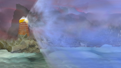
(captured screenshot, of the transition from the main scene towards the credits - gamma, contrast and saturation altered)
it's a good demo nevertheless, and i guess it's just the way you like it, which is the most important thing
animated dreams
If it was for something that did happen at first and last, I'd probably thumbed this prod down.
This demo was too much monotous for my tastes, and the middle part was boring. But I liked the effects at the first part and the credit part.
This demo was too much monotous for my tastes, and the middle part was boring. But I liked the effects at the first part and the credit part.
A bit too long on the lighthouse there.
It's more soft ambient demo than other satori stuff.
I like this. But still left me a mixed feeling.
It's more soft ambient demo than other satori stuff.
I like this. But still left me a mixed feeling.
What Maali and Psonice said.
The Music is great. Besides that the demo is not bad and not great.
If there would be more scenes like underwater look, look on lighthouse and then day is changed by night, if could be perfect.
But what the others said, one lighthouse scene took very very long and I am sorry it is not enough for thumb up :o(
But what the others said, one lighthouse scene took very very long and I am sorry it is not enough for thumb up :o(
This is awesome, dunno what you guys are talking about!
Quote:
You need to get a proper coding attitude.
You must be new to demos or something.
Boring.
so
beautiful prod.
Huh...WTF?
thumb goes for the music
I like! =)
Love it. also WTF people in here telling zden how to make demos?
hm...
i still dont get satory, missed em first encounter so imma leave it a pig for now, maybe i get it later and am able to decide...
liked it much, soothing and smooth
Nice effects (especially the light in the fog and the water).
Imho the lighthouse scene is too long...
Imho the lighthouse scene is too long...
What jack-3d said.
rewatched it on my new gfx card and it looks super mega awesome! 


absolutely looking forward to the next (and longer) satori prod!!


absolutely looking forward to the next (and longer) satori prod!!
Wow, I like this one very much.
It`s like a watercolour painting that came to live.
Though it consists mainly of the lighthouse scene with a rising sun, this is a very relaxing experience (including the music).
Proves that demos dont need D`n`B and tons of scenes (every time). A very artistic and amtospheric approach, thank you!
Kudos
atmospheric
sorry, didnt like this one as much as vokawardoai and koiban. i bet it was a hurry-production release.
good one, without too much graphic colour mess
Soothing, the first scene has something of ghosts or spirits waking up - or drowning. Despite the lighthouse scene being rather ugly, the sky in that scene is nice.
Weak thumb, but *sigh* that warm fuzzy feel <3
Weak thumb, but *sigh* that warm fuzzy feel <3
different
breathtaking.
ok
submit changes
if this prod is a fake, some info is false or the download link is broken,
do not post about it in the comments, it will get lost.
instead, click here !

