|
antisectic by Move
[nfo]
|
||||||||||||||
|---|---|---|---|---|---|---|---|---|---|---|---|---|---|---|

|
|
|||||||||||||
|
popularity : 62% |
|||||||||||||
alltime top: #13035 |
|
|||||||||||||
|
||||||||||||||
| added on the 2001-06-25 09:06:25 by bhead |
||||||||||||||
popularity helper
comments
Cool prod, good music, but in 1998 style, :(((
added on the 2001-06-25 11:46:39 by Trauma Zero 
better than farb raush ... better than all the other demo at takeover but sofware .... too bad .
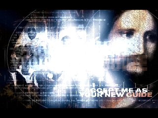
Nice gfx, nice music, nice effect, must be ranked 2nd...
Software is not problem, but perhaps 320*200 is too old.
Software is not problem, but perhaps 320*200 is too old.
I don't know... the usual 1996-1998ish style, no innovation, rather bad music. A demo which i couldn't remember five minutes after i've seen it - except that "i thought those times were over" feeling I had.
kb> i aggree... :)
just a bunch of precalc crap
just a bunch of precalc crap
an effect slideshow with nice screens. the global artwork/design is very cool, the effects are a bit old and somehow simple, and the resolution is old-fashionned...
but it isn't for all that crap. many nowadays "hightech" productions don't reach half of the design/color-coherence of that "old-looking" demo. (and yes! a demo that doesn't need a 3d card.. there are so many oldschool freaks out there pissing on themselves for some shadebobs and a chiptune, so, why not be a "end-of-the-nineties-demo-style"-freak? when demos weren't boring, just half boring :)
but it isn't for all that crap. many nowadays "hightech" productions don't reach half of the design/color-coherence of that "old-looking" demo. (and yes! a demo that doesn't need a 3d card.. there are so many oldschool freaks out there pissing on themselves for some shadebobs and a chiptune, so, why not be a "end-of-the-nineties-demo-style"-freak? when demos weren't boring, just half boring :)
Wow, very different opinions.. I'll just give it a neutral OK. :)
Solid, consistent design, but nothing really interesting. Still, I'd rather see this than a 10-hour 3d engine quick hack job.
Solid, consistent design, but nothing really interesting. Still, I'd rather see this than a 10-hour 3d engine quick hack job.
whatever the screen resolution and the pure software rendering engine... it has a consistant STYLE! it should have ranked 2nd at TO...
I agree with Brioche.
I prefer seeing an old-style demo than a simple 3d card tester with an awfull techno sfx.
I prefer seeing an old-style demo than a simple 3d card tester with an awfull techno sfx.
this demo is a "could have been". I say that because it lacks impact and thus looks bland. the module especially feels very dull, probably in part due to the not exciting samples used there. the graphics and visual effects lack contrast thus also feel rather dull.
i liked the background graphics, nice theme. the music is by zixzaq/eph and uses samples i already knew from eph demos, thus it's not that interesting anymore. overall i think it's a lot more refreshing to see something like this than todays 3d shit.
First I didn't like it, but then I realized it was quite good.
watch it (and Human M) on a telly and you won't notice the low resolution/unaccelerated shit. 8)
nicee 8')
gfx, music, syncro, 2d effects...
I liked it.
I liked it.
Love fx and gfx... :p
je chante sacri !
antiesthetic sorry.
typical visuals for a dark dnb demo from this period. Unsurprising that the musician isn't norwegian, somewhat surprising the other folks aren't :)
I always liked that kind of style and design!
submit changes
if this prod is a fake, some info is false or the download link is broken,
do not post about it in the comments, it will get lost.
instead, click here !
