|
Keep It Short and Simple by NPLI
[nfo]
|
||||||||||||||
|---|---|---|---|---|---|---|---|---|---|---|---|---|---|---|

|
|
|||||||||||||
|
popularity : 57% |
|||||||||||||
alltime top: #23320 |
|
|||||||||||||
| added on the 2010-01-13 06:01:15 by BarZoule |
||||||||||||||
popularity helper
comments
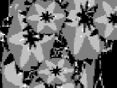
Well, classic effects (bobs, interference) and imho it's too dark, the demo is mainly based on b&w + grey colors.
added on the 2010-01-13 12:05:52 by BackSpace 
Quote:
SetConsoleWindowInfo() failed. Too small screen resolution?
Well, yes. 1024x600. Thanks for excluding my netbook, all other TM demos run fine.
you should have rotated the bobs in Z-Direction !
seems the cube-thingy had some probs with the projection !
the ball is a ruler !
music is kewl somehow ! i think its the 8bit-snare !
seems the cube-thingy had some probs with the projection !
the ball is a ruler !
music is kewl somehow ! i think its the 8bit-snare !
I used my crappy reverse engineering skills and I managed to hack a version that works at least with 800x600 and 640x480 resolutions. It can be found here.
I don't guarantee that it works at all :)
I don't guarantee that it works at all :)
good tune, great beginning. pity, that the colours are too dark and grey.
The sphere was cool. Nice idea for textmode.
short, simple, but boring
okish
Simple, but ok for a first text mode prod
Funny thing.
ok
submit changes
if this prod is a fake, some info is false or the download link is broken,
do not post about it in the comments, it will get lost.
instead, click here !
