|
73 by Ümlaüt Design [web]
[nfo]
|
||||||||||||||
|---|---|---|---|---|---|---|---|---|---|---|---|---|---|---|

|
|
|||||||||||||
|
popularity : 68% |
|||||||||||||
alltime top: #9329 |
|
|||||||||||||
| added on the 2005-08-08 10:24:48 by tsw |
||||||||||||||
popularity helper
comments
well i do!
scary. nice shadows, textures and sync.
nice atmosphere
Creepy as hell. First I thought it was a bit uneventful, but when the first synch projection came, I almost jumped off my chair. Great stuff.
app is closed after "loading bar" on GF5700, W2K :(
This one ruled at the partyplace. First apears to be uneventfull, but then it just proves its point of being a darkambient style production, and i really love it :) Atmosphere!
Video capture please? :)
i don't know what to say.
- ps2.0? if you asked me, it looks like it's going to run smoothly on geforce2-class cards
- yes, I don't like it :)
- yes, I don't like it :)
nice ideas, and some good points to it. Textures could be better for the horn things tho, and there were some texture seems on the walls. Nice enough for a thumb.
Expected more action.
a bit boring ;D
I was just about to hit escape when something happened, then nothing happened again.. no thumb either way.
strange concept. i don't think i'll rewatch it often, but i liked it once.
what las said.. somehow cool, though
if the light of the scene is on the bottom, the texture of the wall should have the shines on the bottom as weel, flip the texture of the wall 180 and do a big jump to the reality ;)
I've been catched by the mood...
You have to watch this product in a dark room, alone, preferably stoned...
You have to watch this product in a dark room, alone, preferably stoned...
looked monotoneous in the beginning but then started to rock like hell
ok - but a bit boring
great stuff.
and strange idea.
however, a bit boring.
however, it still cool.
and strange idea.
however, a bit boring.
however, it still cool.
Boring, unimpressive.
What about that title ?
trace: hmm i had that same feeling. The bumpmap seam to be inverted. Or maybe its part of the intro where normal things dont happen.
oh and the thumb is for the evil plant reaching up and trying to grab you through the ceiling.
i don't know exactly what to think about this prod... nice concept, but it still has the touch "we have some cool tools, but no real music and artists)
i really don't know what to do now, so i'll won't thumb it down. Maybe i'll rewatch it tomorrow...
anyway, i feel weird now. :)
i really don't know what to do now, so i'll won't thumb it down. Maybe i'll rewatch it tomorrow...
anyway, i feel weird now. :)
Interesting atmosphere, a bit boring though. The output flickered strangely in this PC (same bug with Fifa in all the PCs of this netcafe), however I found the most lousy way to avoid this. Keeping the PrintScreen key pressed during the whole show(!!!) ;P LOL.
not bad...but it's incomplete (As you said)
Not my cup of tea, but still gets a pig for trying to be different.
very crappy mapping, little content. however at least it's not disposable mainstream crap, so i give it a piggie as sewer-hentai really turns me on
Very boring. "Music" must be a joke. Lightning/shadows seems to be wrong.
Sorry, don't like it.
Sorry, don't like it.
Gosh. I dunno. Somewhat interesting in concept, but still feels really empty.
atleast it has some quite fresh and original ideas, but could you please change that fucking annoying hackneyed texture in the final ? :>
the shadows appear flaky and it's not *that* entertaining.. i'll wait
the shadows appear flaky
that was the point i think, a parallax(?) bump mapping with correct z-depth shader program :D
that was the point i think, a parallax(?) bump mapping with correct z-depth shader program :D
sorry, but i fell asleep watching this
Very depressing
PS 2.0 only -> waiting for DivX
sucks
if it werent for the shadows, it would be the most boring intro ever.
Sorry, although seems interestings gets a little boring... maybe finished it's ok, but why have not delayed the release?
Cool.
It's like when you make Boards of Canada a "bit" darker. heheheh :D
It's like when you make Boards of Canada a "bit" darker. heheheh :D
I like it's mood.
The sound got this dark "Full Metal Jacket" touch.
The sound got this dark "Full Metal Jacket" touch.
Boring. You guys can do better, this only looked cheezy
in less than 40kB that's cool
but it's no intro and quite boooring so I
must leave with a "nutzvieh" as rating
but it's no intro and quite boooring so I
must leave with a "nutzvieh" as rating
Once in the Middle Ages I was thrown in prison for egg theft and the dungeon corridor was like really long and although the guards were walking me to my cell at a fair pace I felt everything around me slow down and the room started filling with the most unearthly noise. Soon I started to hallucinate. I saw these lights shaped like different symbols I couldn't understand and I could swear the walls started sprouting these like tentacleish arms. I feared for my life but I was in love by the time of my release and didn't want to leave the beauty of those chambers.
:((((( reset my comp.....
so ugly...
doesn't run here. 32mb of ram, what do i expect
: \
there is something about the dungeon look versus synthetic 3d look that kills the atmosphere in this one.. Either it could lean more towards some pure techno universe or make it look like Gears of War.
It had an eerie moment when the tentacles started to appear though. that was pretty cool.
It had an eerie moment when the tentacles started to appear though. that was pretty cool.
way too slow
rulez -b
I like it.
Sorry, but... no.
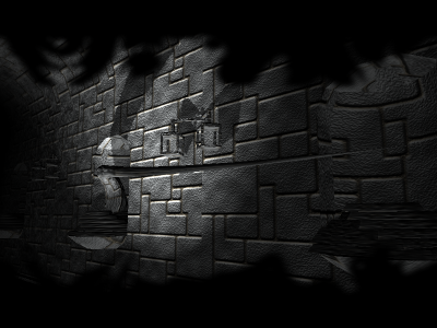
moving inside a dark black&white tunnel,
dark synth music,
tentacles appear,
blue and white holographic icons: circle, cross, ...
dark synth music,
tentacles appear,
blue and white holographic icons: circle, cross, ...
I like it, stylish prod.
Refreshingly new and definately a prod that leaves your amagination to fill the "gaps". Really like it, when groups surprises and jumps out of their stereotype and challenges the audience to wake up and not just consume. Productions of this kind are too rare in my opinion!
Starts well but let me frustrated... Could have been so good :'(
I don't know what to think, I expected something to happen
submit changes
if this prod is a fake, some info is false or the download link is broken,
do not post about it in the comments, it will get lost.
instead, click here !

attention:
- ps 2.0 required
- you might probably not like it.
see the .nfo