|
Inferno by Spöntz [web]
[nfo]
|
||||||||||||||
|---|---|---|---|---|---|---|---|---|---|---|---|---|---|---|

|
|
|||||||||||||
|
popularity : 65% |
|||||||||||||
alltime top: #16109 |
||||||||||||||
| added on the 2002-11-12 01:24:21 by merlucin |
||||||||||||||
popularity helper
comments
Finally it's out! enjoy it! please feel free to email me to merlucin (at) spontz.org for comments, suggestions or bugs X)
added on the 2002-11-12 01:29:32 by merlucin 
music, gfx and design sux
Download link was hell slow, here an alternative link!
Nothing breathtaking here, but I have seen more worse stuff
Nothing breathtaking here, but I have seen more worse stuff
hahahaha.. really looks like mdma :) good work merlucin!! continue!! i'm waiting for the next prod :)~
don't use crest's link! is the party version!
Actually the download link is working better, hopefully not only coz it's shortly before 5 am ;)
rgb gallore.
The difference between the party version and the final one are several fixings in the water scene plus some little skybox aberration corrections, I think the final version looks slightly better X)
oh my god.. the eyes.. and I *am* dutch..
oh my god.. the eyes.. and I *am* dutch..
sorry for posting twice :(
RGB overkill combined with ever so cliche scene-poetry(tm).
Solid code and some good ideas though.
Solid code and some good ideas though.
wooh, did these guys get the _extended_ license to utilize the infamous dutch colorscheme(tm)?
plek, do something man!
plek, do something man!
ok, too saturated colors, I'll remember it for the next time :) I didn't know about the so famous dutch color scheme. It's inferno, it should burn and explode your eyes! XD saturated colors were a design criteria
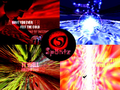
Somehow I liked it even if I felt some parts were not looking that good. It was because of the beginning perhaps, with the red colours, the man holding a heart and the lyrics, the overall feeling. I also read the story in the nfo file, it's sympathic, then I will watch the demo again to try to understand more of it's message. All these makes me to thumb it up!
Nice idea, boring implementation.
(do you really hate so much your densits?)
(do you really hate so much your densits?)
Ugh. Wrong prod. I'm an asshole.
This production has a nice attempt at coherency and stuff, but overall it just seems kinda silly. The music is too light, and the scene poetry is corny. Too bad, because there was/is promise.
Well, I put the wrong vote, but still I don't like it. Too many colour-changes make the production look like 5-6 different productions glued together.
Yes, pan, there are two different parts in the demo. the first one is red-predominant. Simbolyzing a depressive state. "Our own inferno". This gives pass to a dark part, where an amilar sphere rotates in the blackness of the space. There is only a little point of light. Finally we go to optimistic colours such as blue and whiite, when the flare scapes from the water. The demo should end here but as we did not have space to put our credits there is a final part with them. All this stuff is not random ;)
"wooh, did these guys get the _extended_ license to utilize the infamous dutch colorscheme(tm)?"
no, as a matter of fact, this is a proper display of illegal usage of the proprietary dutch color scheme. we will let them off with a warning this time, but if it happens again we'll have to confiscate their machines, sourcecode and probably their eyes too.
no, as a matter of fact, this is a proper display of illegal usage of the proprietary dutch color scheme. we will let them off with a warning this time, but if it happens again we'll have to confiscate their machines, sourcecode and probably their eyes too.
i mean, even mrock's early hellcore demos were less of an eyesore and he did those ON A MONOCHROME MONITOR ;)
uargf
I think this prod was not indended for a monitor, but for a big projection screen
sure!
my monitor have to suffer this painful prod ... and my speakers have to suffer this horrible sound ...argh
Guntz eigf Spöntzprok musikelif unf gelideat! Ortch culemik "Dutch colorscheme(tm)" suckszfuten prowakth lierfthenteslektach. Aleirporelluz!!
Rocked on big screen, although not as awesome on my monitor... It deserved it's third place :)
more colors than fun stuff
As my father said in ye ol times "Me paice a mi que nu sus habeis coscau que esta de puta madre, troncos.Se me espabilen y se me alineen de a uno".
He allways right with this rhing
He allways right with this rhing
For those who want more info about inferno, you can take a look to a short set of pages dedicated to the demomaking, with a log. You can reach this at:
http://www.spontz.org/LeftFrame/Prods/Demos/Files/inferno/Inferno/inferno.html
Please don't hesitate to contact us for questions, donations, etc...! XD
http://www.spontz.org/LeftFrame/Prods/Demos/Files/inferno/Inferno/inferno.html
Please don't hesitate to contact us for questions, donations, etc...! XD
Carmix: Babelfish can't translate it properly :(
It's a nice demo and I think it shows a lot of promise.
thumbs up for the mac os x version.
Our engine is finally completely ported to OS X so here is the first result. There are a few improvements in the scenes, but mainly the demo is almost the same as the PC version!
Reduce your monitor bright and enjoy it again X)
Reduce your monitor bright and enjoy it again X)
ouch.
Not my type of demo, specificaly the first part with the girl taking a hearth in her hand =[~~~~
Anyway, works flawlessly here =)
Anyway, works flawlessly here =)
Sorry aNa|0Gue, really it's a man XDDDDDD
XDDDDDDDD
I promise no more stuff with more than three simultaneous senses
XDDDDDDDD
I promise no more stuff with more than three simultaneous senses
nice
I somehow really like this one. I've seen better effects.. but it has great design and the music rocks. Thumb up!
Poor scene poetry, ugly colours, most scenes consist of a background effect from "ISO standard for demo effects" and a single 3D model on the foreground. Ugh.
sadly not intel macs :(
my eyes
submit changes
if this prod is a fake, some info is false or the download link is broken,
do not post about it in the comments, it will get lost.
instead, click here !
