|
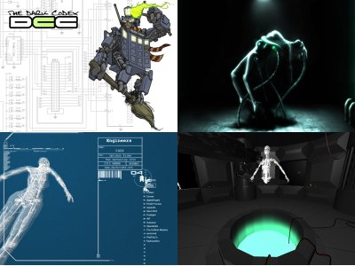
DethBot by Dark CodeX Crew [web]
[nfo]
|
||||||||||||||
|---|---|---|---|---|---|---|---|---|---|---|---|---|---|---|

|
|
|||||||||||||
|
popularity : 60% |
|||||||||||||
alltime top: #16887 |
|
|||||||||||||
| added on the 2008-03-24 01:01:32 by mSW |
||||||||||||||
popularity helper
comments
Messy.
Ok, but the second part was very slow ( 3100+ AMD 1GB 7300GT) and there was a little Z fighting!
uhh terrible
Not bad
The second part crawled like ants don't.
I really enjoyed the part with welding :) It looked great! The female robot model looked great too. I liked her better as a robot than as a "human" :)
The assembly scene and the pixeled image was decent, but overall not that interesting. Music could've used some work as well.
What eladamri said
Haha, the ending is really bad but very humorous. :D
Aside from the ending, the music is cool and the rest was nice, I liked it. :)
Aside from the ending, the music is cool and the rest was nice, I liked it. :)
Half the demo turned into a glitch-track video here which I don't think was how it was meant to look.
There is something boring about the lighting of the scenes.. Maybe some ambient light can do something? I used to hate ambient lightning, but I kind of got my eyes up for it lately. Look at this video for example for some nice use of blue ambient light mixed with other colours for a sweet look http://www.youtube.com/watch?v=ymh13G8YgQE .. I guess you use 3d studio or similar where you can have it generate lightmaps n shit for you too. It looks too flat with just normal gl lighting.
Nice to see some animation and the models are promising.
gee.. that robot at the end has some potential! His feet made me think about windsurfing. More of windsurfbot pls.
started well, ended crap. guess the deadline caught up.
and yet again, electro drumnbass for a soundtrack.. seriously, norwegians: there are more music styles that you can use to make awesome demos besides electro drumnbass.
and yet again, electro drumnbass for a soundtrack.. seriously, norwegians: there are more music styles that you can use to make awesome demos besides electro drumnbass.
you are getting technically dangerous. however, too many design/modelling/texturing flaws and little or no polish makes you nazareth's and playpsyco's bitches once again ;)
Not my favourite style of demos, and the color scheme was rather awful. So piggy...
Didn't like it. It looks messy and after the middle it gets boring or annoying.
Some nice parts and some parts that I didn't like at all. Feels like wasted potential (caught by deadline?), so piggy.
yeah, the deadline caugth us. We decided to start creating this demo 5-7days before The Gathering so the time was really an issue here. It contains a lot of bugs on different hardware, but should run OK on a Vista machine. Don't know whats wrong but I'll see if I can track 'em down.
Thanks for all feedback.
Thanks for all feedback.
Either it didn't work properly, or then it was just pretty awful, sorry :/
The framerate was something like 2-3, the scenes were mostly very dark and there was nothing interesting on the screen.
The framerate was something like 2-3, the scenes were mostly very dark and there was nothing interesting on the screen.
Great job! I'm eagerly awaiting a demo that isn't rushed;)
oh god this was just very very bad... no offence guys but... swapping in the middle of the demo for lowpoly scenes? that was just such a final insult. (sorry, a bit too tired to be constructive now :/ )
the pig goes for the lovably annoying loading screen.
the pig goes for the lovably annoying loading screen.
the wannabe dezign is a bit of a turn off, and there's no reason for it being this slow. the room with the robot in it is soo inconsistent - bumpmaps (or something) on the doors and no texture on the floor - wtf?! Good parts are the introscreen (lovably annoying indeed), and the 2d gfx at the end.
last scene was fugly... and for the rest goes a pig - not so bad.
bad music and LOL :(
Pretty borked, but with some nice ideas and a proper tune
"i have no plan" describes the demo pretty well i think ;)
submit changes
if this prod is a fake, some info is false or the download link is broken,
do not post about it in the comments, it will get lost.
instead, click here !

everything feels hacked together without any sophistication. music is really annoying to me.
liked a few moments tho, so a very complaisant piggy from me.