|
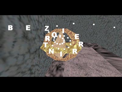
BEZIERRINTRO by Pantuflas Software
[nfo]
|
||||||||||||||
|---|---|---|---|---|---|---|---|---|---|---|---|---|---|---|

|
|
|||||||||||||
|
popularity : 59% |
|||||||||||||
alltime top: #62459 |
|
|||||||||||||
|
||||||||||||||
| added on the 2007-07-23 21:17:34 by ltk_tscc |
||||||||||||||
popularity helper
comments
bleurg... those textures are so 1995...
sucks added on the 2007-07-23 21:18:20 by ltk_tscc 
Ouch...
Nice idea with the scroller not with those colors and textures...
Sorry.
Nice idea with the scroller not with those colors and textures...
Sorry.
really don't like the textures and the music ... also it seems there's no real flow/design story-line ...
It's so ugly it and low poly it reminds me old software intros from 1995 :)
go go go \o/ !
music is somewhat good tho, but quake 1 quality sucks, really
seriously... no
Pretty glitchy, The colours looked garish too sorry... .
my eyes.. god bless esc support
at least quake1 was funny to watch (and play)

Nehe lesson 3 meets Euskal. Good luck with lesson 4 (lighting maybe?).
a decent demo ruined by the worst case of coder colours i have ever seen
everything has been said
I'd say it's not that bad if it's a first try, keep working, and good luck..
:o
start doing 4k's
Just bad and boring.
This prod is 8 years late.
boring :(
C64 YEAH PC NOPE
Sorry, no :( but keep on trying.
15 years too late... nowadays we have shading
Ok for 1995.
submit changes
if this prod is a fake, some info is false or the download link is broken,
do not post about it in the comments, it will get lost.
instead, click here !
