
|
versus #3 by Nukleus [web] & void
[nfo]
|
||||||||
|---|---|---|---|---|---|---|---|---|

|
|
|||||||
|
popularity : 63% |
|||||||
alltime top: #9564 |
|
|||||||
| added on the 2005-10-14 03:50:51 by dipswitch |
||||||||
popularity helper
comments
Nice to have #3 of Versus Amigacharts.
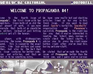
It comes with a lovely startpic and a neat tune. Some nice articles would be even nicer if readability would be better. ;)
All 12 ALiENthumbs up for Amigacharts in 2005!
It comes with a lovely startpic and a neat tune. Some nice articles would be even nicer if readability would be better. ;)
All 12 ALiENthumbs up for Amigacharts in 2005!

pretty nice to confirm some obvious things.

big thumb for holding strong and vast improvement!
On my UAE config it freezed after one minute but that could be still the replayer.
I'll read it completely on a real Miggy at home :D
On my UAE config it freezed after one minute but that could be still the replayer.
I'll read it completely on a real Miggy at home :D


I've got quite some gfx glitches on my A4k. Still, thumb up for releasing a chartmag in 2k5.

I haven't read it all yet but it's a successful magazine for sure.

The text is quite hard to read, but thats my only complaint ;-)

The interface was too ugly, it was too hard to read and I couldn't access the text files like in previous issues. The contents might be really cool, but its too much hassle to read. Sorry.

Oh and before I'm accused of trolling or talking shit. Just look how it compares to other random OCS mags.
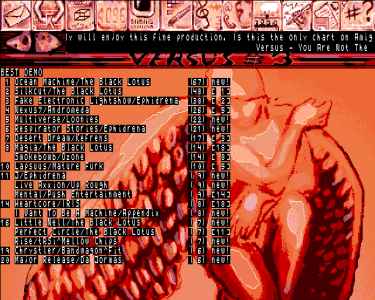
Sorry guys, but the visuals are really below par!
Sorry guys, but the visuals are really below par!
It's a diskmag, it's on Amiga, it upset shane, what, how could it get better?

dunno if the visuals could be better. used a hexeditor as my winuae f*** up. :/ but i'm sure it rules anyway. expect my votes again for the next issue.
Shane: I`m pleased you posted those screenshots. I agree totally.. It would appear everyone has lost their standards and just purely thumbs up just because its an Amiga diskmag release.
If i am to be completely honest, it looks dreadfull.
If i am to be completely honest, it looks dreadfull.

content is what counts in first place.
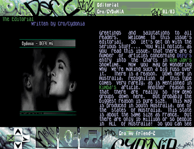
Hi all Versus fans!
Of course I don't expect everyone to like our production. You don't have to be polite ;-) Me personally, I don't like the way the font is shown over the background. But what would life be without improvements?
Thanks for supporting and keeping the Amigachartmag alive!
Shanethewolf: Jesus bless your soul! I didn't know you were such a great artist!! You know, I really dislike people with big mouth just complaining and doing little or any action themselves. But you seem to be different! Nice art works of yours! More chance to get in touch with me here instead: browallia[at]amigascne[dot]org (pretty pretty please!!!!) so we can talk to eachother like brothers in arms.
my thumb up is for you, Shane my mate!
Keep your good pixel art up!

browalia: I never said I was a better artist, but like Darkus said it's like sceners thumb up every amiga release even tho the standards are low.
We all look at scene prods and think if we like the music, gfx or code and judge em and I really don't like the gfx or design for this mag.
Could I do better? Probably not but I would ask someone else to do the job for me.
We all look at scene prods and think if we like the music, gfx or code and judge em and I really don't like the gfx or design for this mag.
Could I do better? Probably not but I would ask someone else to do the job for me.
Oh and I aint picking on this mag. I think the quality of most Amiga releases has dropped to crap in the last years. I didnt like the latest pain gfx either.
Actually Shane, when you stopped making Amiga "releases", the average quality went up 5,000,000,000,000,000,000,000,000,000,000,00.4%
Ok, I'm going to open my big mouth and complain too. The intropic was ok, as for the rest of the graphics/interface I have to agree with Shane and Darkus. Sorry...
It would be nice if you could either get rid of the background picture or remove the black squares behind the text before you release the next issue - as it is, trying to read the text is just annoying.
It would be nice if you could either get rid of the background picture or remove the black squares behind the text before you release the next issue - as it is, trying to read the text is just annoying.

Good work, hope you guys can keep up the release rate, and that you'll get plenty of vote-support for the next issue.

props for the charts, and content, but the rest.. keep 'em coming though, i enjoy amiga charts for sure. a piggie for me.
Shane:You can't mix up panels ecs and aga graphics. That's like comparing apples with citrons!

Ghandy: I just think it comes down to a lack of good active pixel artist. I have seen plenty of ecs productions with mind blowing graphics.
I'm 99% sure all the screenshots I posted above ARE from ecs magazines. At least they are posted under ecs here on pouet.
And I'm 99% sure at least one screenshot posted above is from an AGA production! :)
Nice to see theres a mag out on amiga, although yes it does look quite ugly especially the text! Btw. yes Generation was AGA i think. Everyone is entitled to their own opinion but until you've done anything worth talking about on the scene, it doesnt mean shit coming from you!

no offense but i have to agree to shane.
its time to change to AGA. perhaps you will get some more support with gfx then.
it dont even makes sense to stay ecs at this days
its time to change to AGA. perhaps you will get some more support with gfx then.
it dont even makes sense to stay ecs at this days

Where have all 'em old-skool graphicians gone? :)
Thumb up for the 5 (!) guys who voted "Trip to breakpoint" into the game charts
(Even though it's not even finished). I love you for giving me that motivation...stay tuned.
(Even though it's not even finished). I love you for giving me that motivation...stay tuned.
xeNusion: I don't really see any point in moving to AGA, as long as it is possible to make a good looking OCS chart or mag. (Check out Trashcan by Network for a fairly recent (ok, 6 years old...) example)
ma`am, its a fact that no one is left for doing it on a level comparable with the old standards.
i would perhaps do something for it but only
in a less time consuming way (tablet+reduzing+fixingmanually).
beside of this... who is still using a ocs/ecs machine at this days?
pixel something for the next versus and i will never cry for aga again.
i would perhaps do something for it but only
in a less time consuming way (tablet+reduzing+fixingmanually).
beside of this... who is still using a ocs/ecs machine at this days?
pixel something for the next versus and i will never cry for aga again.
Generation has been for some issues delivered with aga & ecs panels. Shanes' screenshot was the one with the aga panels.
Anyway: Honestly, it is a good idea, why doesn't Mermaid paint the next panels? I am sure Browalia is busy enough with many other things and would appreciate the help from outside. Especially when it comes from such a talented graphician like you, Mermaid. And I mean it seriously!
Anyway: Honestly, it is a good idea, why doesn't Mermaid paint the next panels? I am sure Browalia is busy enough with many other things and would appreciate the help from outside. Especially when it comes from such a talented graphician like you, Mermaid. And I mean it seriously!
yes it's real difficult to read with the black squares...

fills it's purpose I guess... the design need some work though.
New Link for fixed version of Versus:
http://www.nukleus.se/vs/vs3-ami.lha
http://www.nukleus.se/vs/vs3-ami.lha
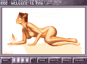
Cool intro pic, but the rest is rather ugly :(
The text is quite hard to read, a better font and a simpler background would have helped.
But it's always nice to see new Amiga charts being released!
The text is quite hard to read, a better font and a simpler background would have helped.
But it's always nice to see new Amiga charts being released!

Scenediving in our closet. No, not really but the staff had to improve a lot things since its starting phase. Many readers mocked about that font in issue three and how unreadable the texts were inside that edition. One can discuss if it really makes sense to produce a mag for ECS chipsets only as that way you set a lot limits when it comes to the number of colours and the resolution - but however, that`s how Rumrunner and Browallia want it. Their slogan
"You are not the only one!" is indeed not true. Versus is the only active chartsmag around and during the past months and years that prod did improve in many aspects. They`re currently asking for the public to participate, so go and place your vote!!
"You are not the only one!" is indeed not true. Versus is the only active chartsmag around and during the past months and years that prod did improve in many aspects. They`re currently asking for the public to participate, so go and place your vote!!
Better something than nothing...

Agree with mailman. But it is not so bad, neither.

submit changes
if this prod is a fake, some info is false or the download link is broken,
do not post about it in the comments, it will get lost.
instead, click here !
I'd like to see it as a production for AGA machines only (a lot more colours possible etc.) but that's their decision.