|
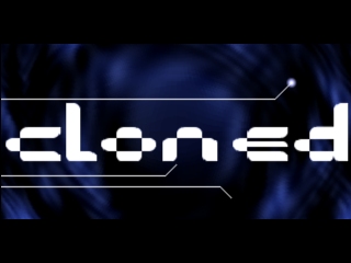
cloned by Dawning
[nfo]
|
||||||||
|---|---|---|---|---|---|---|---|---|

|
|
|||||||
|
popularity : 62% |
|||||||
alltime top: #9992 |
|
|||||||
| added on the 2002-01-28 16:31:25 by dairos |
||||||||
popularity helper
comments
not bad! nice music combined with fairly cool effects.
not too technically impressive but still manages to entertain and got a nice atmosphere, better than the borish winner in my book.
Cool atmosphere!
However, enable me a little positive critics:
- The middle part of the music reminds me a bit of Halcyon's Saint.
- Jumping cubes are a bit too often :) Next time, add some FOV-manipulation, or sg :)
- Increase ambient... (brightness switch is too far away on my monitor >:)
Overall thumbs up tho'!
However, enable me a little positive critics:
- The middle part of the music reminds me a bit of Halcyon's Saint.
- Jumping cubes are a bit too often :) Next time, add some FOV-manipulation, or sg :)
- Increase ambient... (brightness switch is too far away on my monitor >:)
Overall thumbs up tho'!
Far from being crap
interesting music + lores design. synchronisation could be improved.
okayish, the saint-ripoff is a bit cheap.
ripoff? :) yes yes, i used some drum samples from saint... but anyway... i tried to do stylish music :)
don't flame me, please ;)
don't flame me, please ;)
Dont be too hard on yourself Dairos, we have all seen prods that makes this far from ugly, slow and suck very much!
cOOl Effect And Music!!
This demo is O.K.
This demo is O.K.
yes.
I only get a 404?
DiamonDie: Sorry, my fault. try again.
some pretty nice effects and music.. the ending was cooool.. :)
nice job..
nice job..
nice intro guys ;] i love intros and especially when i know most of the makers/coders/musician and bla bla working on it <it is not that subjective but still okay..
CoaXCable/CoolPHat 2oo2
CoaXCable/CoolPHat 2oo2
I thought this to be OK. Hmm... Thumbs up or no thumbs up, that is the question. I can't decide, so I'll leave a neutral comment. Sorry...
Quite nice, well synced and executed. My only (ass-coder) complain is that some primitives aren't rasterized with subpixel! Otherwise nice prod
ROxor !!!!!:P
ehh come again?
*heavily* inspired by certain danish intros and demos, only executed uglier.
I can't say this intro has anything special or whatever, music is boring... blah
*heavily* inspired by certain danish intros and demos, only executed uglier.
I can't say this intro has anything special or whatever, music is boring... blah
pretty much lives up to its name, being a copycat of some demo-design ideas. still, it's not entirely without its moments.. 8]
poor nula...of all samples, you had to pick that one. I think that even using a vocal of a 2unlimited song would have been less unfortunate =)
Oh well. Decent-ish intro, design is borrowed from here and there (those jumping cubes look suspiciously like the ones in square, only less pretty) but it's not THAT bad.
Oh well. Decent-ish intro, design is borrowed from here and there (those jumping cubes look suspiciously like the ones in square, only less pretty) but it's not THAT bad.
quite enjoyable. not very exciting perhaps, but still...nice.
hm, did this run in 16bit colors?
just to make some things clear:
ile/aardbei: yes, it is a "clone meets clone"-clone with some ideas from other prods aswell.
shifter: hmm, I don't remember jumping cubes from square/pulse.... but I remember seeing some in the clone-intros ;)
A_Lee_N: it is 32bit, but I admit that it looks like a 15bit intro due the ugly colors.
So anyway, it is called "cloned" because it is mostly a clone of the clone-series/fudge and klone/dcs demo.
"only one is original, others are cloned"
quite nice but nowadays lo-res just isn't enough. also the ripped samples from saint were a bit too obvious and colours were ugly.
but overally i like this one.
but overally i like this one.
shifter: what are you talking about??? i liked samples i had used...
Just watched Saint for the first time with the Unique posse at Mekanisaatio'02... I guess it sounds quite same, but who really cares? Every musician has ripped samples at some point of his life.
sample-ripping is ok, but the middle part really sounds like the beginning of saint soundtrack. like he ripped the whole pattern. at least the "riff" sounds kinda same, except it's speeded up.
some old ideas and some new ones. Enjoyable demo
It's not slow at all even on my outdated machine. And it wouldn't be ugly if it wasn't for the lines and those cubes, argh! Why always the cubes. I also disliked the music.
noticed the url was dead, fixed that.
once again: http://cog.darktech.org/dawning/cloned.zip
okaish. mimicing clone meets clone.. not as good as the original.
No download available :(
i'll try to find the intro when home - i'm sure i still have it.
Fixed the download link
Nice but not the demo I was searching for (i think).
submit changes
if this prod is a fake, some info is false or the download link is broken,
do not post about it in the comments, it will get lost.
instead, click here !

this intro was supposed to be released the 0a000h party, but due the lazy functionality of hotmail, it wasn't sent in time to our german member...
anyway, it's ugly, slow and it sucks very much.
Enjoy!