|
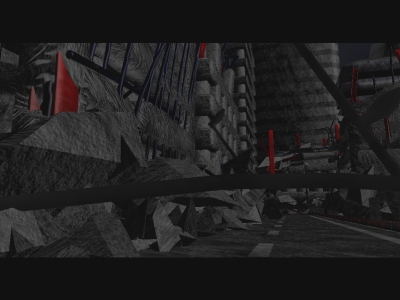
Green Wave by SystemK [web]
[nfo]
|
||||||||||||||
|---|---|---|---|---|---|---|---|---|---|---|---|---|---|---|

|
|
|||||||||||||
|
popularity : 62% |
|||||||||||||
alltime top: #51159 |
|
|||||||||||||
|
||||||||||||||
| added on the 2005-05-31 17:07:05 by kioku |
||||||||||||||
popularity helper
comments
32mb big. They are getting bigger and bigger. It looks nice, but has a few major glitches. The scenes are simply to long.And somehow I don't find the music fitting for this demo.
okayish
havent had the feeling from the comments above its worth the wait of a 32mb download?
ok music, terrible graphics, slow code.. good ideas/concept tho :) piggie
Would be a lot better without those graphical glitches. Or are they intended?
wooow, that was ugly. and slow. looked and sounded like a quite bad 64k, with models+textures that look generated, and music that sounds like a softsynth.
i'm guessing the glitches aren't intentional..? featured what appears to be the world's worst grid warper for the credits, different objects in the scene moving out of sync with other objects, a really ugly tidal wave.. oh man. no idea where the ps2.0 hw was used, either.
oh well, at least they tried. it's a pretty difficult and grand concept to get right.
cheesy message.. and the mentioned glitches ("stuttering" objects).. the wave-animation is okay, but the rendering of the water=yuk..
nontheless overall pretty okay'ish..
nontheless overall pretty okay'ish..
well... the size doesn't justify the content I think. Nice effort, poor result.
smash: I would guess that the ps2.0 effects are used in the water rendering at the end scroller and perhaps in the text-grid effect at the start. If not there than it's an unsolved mystery! :)
No effect in this demo was so advanced that it couldn't have been made with the same result in vanilla ogl I think. Why use ps effects when it's not needed?
i find it overall quite nice somehow, despite the flawed gfx, typos, etc. i like the music most of the time too, even if this trancey thing is not my style. it looks like it was planned to be a 64k intro because of the low-detail gfx and simple synth sounds.
The oval shaped moon? bothered me.
Some textures seemed stretched and not mapped that well. Bleak washed out sky in the end. Music was ok. Rest ok.
Some textures seemed stretched and not mapped that well. Bleak washed out sky in the end. Music was ok. Rest ok.
much much much to big for what it is, wont fly in demoscene
Design flaws, but lots of work you find in it.
i hate to say it... but smash you are right
smash is right, but it's even ugly from a 64k point of view :) however it's japanese, so kudos for the effort.
damn, am i getting a reputation for being a cruel and harsh critic? im not, honestly! =)
i couldn't delete this fast enough.
herm... not.
Quote:
Why do you expect less quality from the Japanese than from sceners from other countries? The Japanese are as smart as Europeans, if not even smarter. And I don't think the language barrier plays a role as probably there are also a lot of good graphics programming tutorials available in Japanese.smash is right, but it's even ugly from a 64k point of view :) however it's japanese, so kudos for the effort.
dead link & no mirrors
i was expecting a much more after moody introduction. nevertheless not that bad.
meh.
submit changes
if this prod is a fake, some info is false or the download link is broken,
do not post about it in the comments, it will get lost.
instead, click here !

Systemk is a demogroup in Japan that has acted for two years.
interesting style and cool music.
however, some gfx ain't good.
however, I think still cool.