|
Act 3 by Reversed Engineers
[nfo]
|
||||||||||||||
|---|---|---|---|---|---|---|---|---|---|---|---|---|---|---|

|
|
|||||||||||||
|
popularity : 63% |
|||||||||||||
alltime top: #12196 |
|
|||||||||||||
| added on the 2004-05-10 13:35:50 by sybeX |
||||||||||||||
popularity helper
comments
A significant improvement since your last demo.. I'm impressed! I loved the transition from the eggplants to the metaballs... nice atmosphere as well..
You need to polish your design and textures... but you earned a well deserved thumb up from me
Well Done. I'm expecting higher from you in your next demo.
You need to polish your design and textures... but you earned a well deserved thumb up from me
Well Done. I'm expecting higher from you in your next demo.
Was that the demo with the satellite, the plate we sent to aliens and the nice oldschool fire effect? I liked that! :)
Good flow, some amazing ideas (that double stars texture had me leaning closer to the screen), an awesome metaball part hitting you in the face after a walk in a garden of hi-tech flowers.
RE have caught my attention. Don't let go now guys!
RE have caught my attention. Don't let go now guys!
really nice!
no comment
pretty goddamn horrible. awful graphics, models and keyframing. the code shows that you at least have some basic knowledge, but needs to be speeded up - it lagged on my gf4ti4600ultra in scenes which ought to be a piece of cake. sorry guys, better luck next time.
Didn't amuse me. However some points for the johnsson hanging between the studs legs... or maybe it was just a bug? :D
a teriffic demo,nice effects, good music and very smart transitions between the scenes.way to go Reversed Engineers!
Id be amazed if the willy stayed on after being slashed to bits by intersecting geometry. Improve the textures, music and camera movements and Ill be happy.. Its a bit too wacky for me the way it is now..
oh come on guys! i'm no way affiliated with the group, but anyone who thumbs this prod down becomes my personal grand enemy! so beware! :>
i haven't got the slightest idea who you are or why i should care, but you obviously have no taste - my thumb-down stands. :)
maybe it is some kind of norwegian thing to dislike this demo.. subliminal images of polar bears being mistreated might be in the demo somewhere
either that, or it's simply that it's crap. :)
Or maybe it's just mediocre. :)
very ugly and boring
Well, compare that to their previous demo (A scener's brain) and you'll notice that this one is at least 500% improved over the previous. They started from scratch last year, so they surely deserve a thumb up for a great effort, a great improvement and some very interesting ideas.
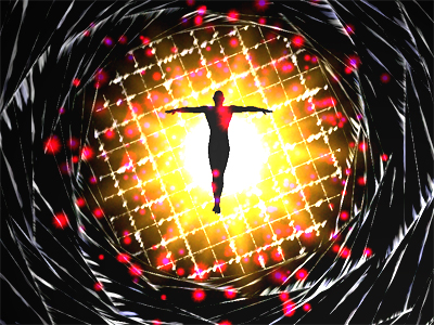
Since it's your first pc-demo I won't thumb it down, but please think a little bit about the colours/textures next time, ok? (the feedback-thingy shown in the screenshot was pretty cool, though - too bad it was ruined by clipping-issues...)
please please please get a designer.
Very good prod, you definitely deserved the 3rd place, great job, keep it up!
A very big step forwards. The colorscheme needs work ! (haha, says who ?!)
I loved the digital flowers scene.. and some parts of the music. nice production from RE :)
btw it runs only windowed on my ATI..
My favourite prod from ReAct :-).
This one needed some more effort on the artistic department (graphics/design/music) and the camera over the satelite was rather fast, but it's surely much better than their previous productions. Also the theme with the Voyager (or was it Saturn?) probe was very interesting.
moT : actually it was Pioneer, only this one had the golden plate at the beginning inside it,along with some Bach music.
i like a lot the flowers scene :)
okish
submit changes
if this prod is a fake, some info is false or the download link is broken,
do not post about it in the comments, it will get lost.
instead, click here !
