Colors.
category: general [glöplog]
Ok, I have been discussing this with texel during the week I was staying at his place. I got some good recommendations but I want to hear some more ideas..
What constitutes as good colors what not?
In which ways do you personally choose the colors for your demos?
Which mistake am I usually making with the colors in my older demos?
Is there some primary theory of how to chose good colors for my demos?
Any examples of good colors in demos or bad colors in demos?
Bonus question: What is coder colors and what dcs?
coder colours = colours with obviously no thought behind them, there mostly because if everything was the same colour you wouldnt see the difference between the various things going on.
dutch colour scheme = coder colours, with the added restraint that there have to be many of them, with high saturation.
though maybe rasmus has a better def for dcs, after all he invented the term (and actively countered it with flatshaded cubes)
dutch colour scheme = coder colours, with the added restraint that there have to be many of them, with high saturation.
though maybe rasmus has a better def for dcs, after all he invented the term (and actively countered it with flatshaded cubes)
Top coder colours: #ff0000, #00ff00, #0000ff, #00ffff, #ffff00, #ff00ff
Good colors = neon colors, coder colors and dutch colorscheme. Many different colors at the same place rules, that's why FLI rules.
Quote:
What constitutes as good colors what not?
Colors that match = GOOD
Colors that clash = NOT GOOD
Quote:
In which ways do you personally choose the colors for your demos?
Taste.
Quote:
Which mistake am I usually making with the colors in my older demos?
Can't be bothered to watch them.
Quote:
Is there some primary theory of how to chose good colors for my demos?
Yes - it's called color theory.
Quote:
Any examples of good colors in demos or bad colors in demos?
Plenty.
Good colours are colours that give you eye cancer or burn the retina.
Spoken from a true dutch person ;)
but really, you can't define "good colours". it depends on what you want to do. a goa demo, f.ex. sts-03 looks great with many bright colours, yet i think that few would call it dutch colour scheme. rob is jarig is a well known example of a very similar colour scheme gone bad.
i, for one, think that the colours in metamorphosis are horrible. i just think it's a horrible look. a fun demo to watch, but not pretty. obviously, most people here disagree.
just avoid the super-obvious crap-combinations, be critical of yourself, and think about how colours fit the type of action you want to put on the screen. the choice of colours is just a minor part of all design choices to be made, and i daresay that many of those other design choices are more important, possibly even able to "correct" badly chosen colours.
Oh allright then, I'll strive for constructiveness instead: This is a really nice tool for finding matching colors - go wild.
>Colors that match
>Colors that clash
How do you find which colors match or clash? By eye? By experience? Do you get the colors by watching birds? Or chosing in the warm/cold color circle? Or getting black/white which matches with everything? Or watching some demo with colors and copying what most people think is ok?
>Colors that clash
How do you find which colors match or clash? By eye? By experience? Do you get the colors by watching birds? Or chosing in the warm/cold color circle? Or getting black/white which matches with everything? Or watching some demo with colors and copying what most people think is ok?
Wow, thanks for the tool (I posted the above before reading your comment). But still it would be interesting to read more opinions or how does anyone do it personally.
Also, little question, if I get for example some five color that match and create gradients for every combination of these five colors, I guess the colors would still be ok?
wow, i like that kuler thing.
optimus, gradients are almost always ugly :)
Another thing you could is to take some colours from a painting or picture or whatever artwork you like.
+do
Rob: Kuler also allows you to do that (either upload one or pick one from your Flickr-account (or someone elses))
Quote:
How do you find which colors match or clash? By eye? By experience? Do you get the colors by watching birds? Or chosing in the warm/cold color circle? Or getting black/white which matches with everything? Or watching some demo with colors and copying what most people think is ok?
If you can't see clashing colors by eye, than you will always make coder colour demos!
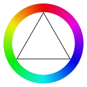
HOW TO MAKE HALFDECENT COLOUR COMBINATIONS IN 3 EASY STEPS
(simplified edition for visually impaired computer programmers)

1. pick a colour on the disc
2. cap saturation value of the chosen color at 75%
3. a suitable "combination colour" can be found by rotating the disc 120 degrees in either direction (aka shifting hue 120 degrees)
(simplified edition for visually impaired computer programmers)

1. pick a colour on the disc
2. cap saturation value of the chosen color at 75%
3. a suitable "combination colour" can be found by rotating the disc 120 degrees in either direction (aka shifting hue 120 degrees)
for example, checking colors from photoshop color matrix is much more accurate than typing random numbers such as glColor3f(0.1f, 0.1f, 0.2f) (only 10% accuracy as one can see) - at least the colors won't hopefully look too much like coder ones, as you've got visual clue :)
good colors alone won't make anything look good, but bad colors can break anything.
optimus: see the beijing 2008 opening show for examples of perfect matching colors...
...except the daring flashy sequence haha
...except the daring flashy sequence haha
There are some good apps for choosing colours, plus good websites. Grab one of those and experiment. They'll give you tools to pick colours based on the thing havoc posted, plus a few other methods of picking complimentary colours.
