| OcineL - Demo 2 by Artisanal Lights & Magic [web] | ||||||||||||||
|---|---|---|---|---|---|---|---|---|---|---|---|---|---|---|

|
|
|||||||||||||
|
popularity : 59% |
|||||||||||||
alltime top: #29511 |
|
|||||||||||||
| added on the 2003-05-18 14:45:07 by OcineL |
||||||||||||||
popularity helper
comments
big, boring, buggy.. and horrible music. sorry.
this is good for a first demo
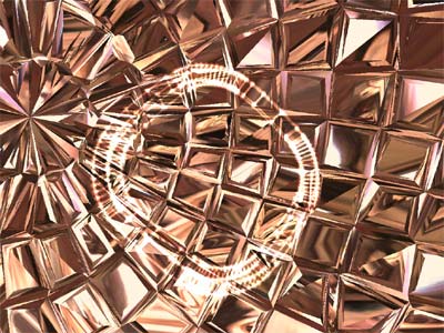
there are a lot of bad things to say about this demo. But i would like to point out that the effect on the screenshot actually could have been really cool. Next time, try giving the demo an overall design. This is a strange mixture of disgusting and ok effects with no relation to each other. the demo crashed at the church scene.
very nice job with a cool music
My goodness. This feels so unfinished and/or first attempt-ish. Yet there are some really promising parts. The "pink bubblegum" trees were neato, and a few other parts looked quite interesting. But some geometry popping up, horrible texturing faults and just generally crappy framerates are quite disappointing. Too bad.
Oh, and the music is interesting too. Not the usual boom-boom-boom-boom.
Oh, and the music is interesting too. Not the usual boom-boom-boom-boom.
There are things that could be fixed, but it's very nice for beeing a first production..
Oh my, where have you ripped that music from? At least it was refreshing, just like most of the demo. And yes, the scene in the screenshot was rather nice.
an original music (even if commercial ;)), all the scenes are well designed and rendered... only 1 problem : it lacks a cohesion, a main idea or design that would be going through all the demo imho.
Good work for a first prod.
Anark = Arnaque
agree with JosSs
I'm with Zest - Needs more of an overall theme or some sort of visable guiding idea. As it is, it's too random to be anything more than a simple graphic display [most of which were nice, btw]. Work on optimization too - too big. Look at what FR does in 64kb.
Keep working at it though!
Keep working at it though!
strange and unusual music, is anapoda from you? if yes, so great, it's strange but good lyrics. (your mp3 is bad encoded coz it is full of grrzzz on my system)
too much centered effects, too light design and uncoherent color sheme and scenes, but lots of good reflexions and refractions.
single exe file is a +, what is 'artisanal light and magic' ?
it's promising for a better future prod from you
too much centered effects, too light design and uncoherent color sheme and scenes, but lots of good reflexions and refractions.
single exe file is a +, what is 'artisanal light and magic' ?
it's promising for a better future prod from you
submit changes
if this prod is a fake, some info is false or the download link is broken,
do not post about it in the comments, it will get lost.
instead, click here !

It's made with Anark.