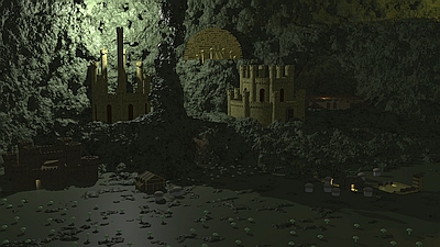
| Dungeon HMM3 | ||||||||||||||
|---|---|---|---|---|---|---|---|---|---|---|---|---|---|---|

|
|
|||||||||||||
|
popularity : 54% |
|||||||||||||
alltime top: #24503 |
|
|||||||||||||
|
||||||||||||||
| added on the 2020-06-20 19:43:41 by Lovely Hanibal |
||||||||||||||
popularity helper
comments
not so sure about the colors but overall very nice! lot of detail in there.
rulez added on the 2020-06-20 19:51:25 by sensenstahl 
Looking kinda ok to me!
details :)
Liked this, the modelling is fantastic. Could use nicer lighting, maybe.
Really impressive modelling for the size! I love the different kinds of buildings you managed to fit in here. Unfortunately I have to agree about the lighting. What I would suggest is using colours based on temperature. These colours appear in nature often, and are specified with a number in kelvin. It is based on what colour of light an idealized object of that temperature would emit, and is often used to categorize the colour of light bulbs.
see here for more details: https://en.m.wikipedia.org/wiki/Color_temperature
I would also suggest not adding an ambient colour to the shading. The phong model suggests doing that, but I find it tends to wash out the image. What might work better is to something like this:
That last line adds a little bit of ambient light, but it still is proportional to what direction the normal vector is pointing, so you get a smooth gradient instead of a solid colour in the dark parts of the image. Ambient occlusion also helps.
see here for more details: https://en.m.wikipedia.org/wiki/Color_temperature
I would also suggest not adding an ambient colour to the shading. The phong model suggests doing that, but I find it tends to wash out the image. What might work better is to something like this:
Code:
vec3 normal = ...
vec3 lightdir = ...
float diffuse = max(0, dot(normal,lightdir));
diffuse += dot(normal,lightdir)*.1+.1;
That last line adds a little bit of ambient light, but it still is proportional to what direction the normal vector is pointing, so you get a smooth gradient instead of a solid colour in the dark parts of the image. Ambient occlusion also helps.
i like the look of this
I love the desgin! Check out these two articles by iq for some lighting tricks: outdoors lighting, palettes.
Good memories :) HOMM3 thanks! Very cool!
very much the same style as NWC was doing 3D stuff back in the 90ties. Typical Autodesk 3DS 4.x stuff ;-) nicely replicated.
nice
submit changes
if this prod is a fake, some info is false or the download link is broken,
do not post about it in the comments, it will get lost.
instead, click here !
