| Zef by Gluster | ||||||||||||||
|---|---|---|---|---|---|---|---|---|---|---|---|---|---|---|

|
|
|||||||||||||
|
popularity : 50% |
|||||||||||||
alltime top: #45433 |
|
|||||||||||||
| added on the 2015-08-06 13:13:52 by OgreSound |
||||||||||||||
popularity helper
comments
In many ways also the best in the compo. Proper flow and editing, good variety of effects and a good self-made soundtrack. I was surprised this was not in the top 3.
rulez added on the 2015-08-06 14:48:33 by noby 
yeah, there was a lot of high quality content and the direction worked nicely!
This is your 3rd production and I can see you've improved a lot!
Track does fit the demo fairly well and carries the demo nicely even if there was not much of a theme in the demo.
Biggest problem was the overall emptiness of the background in many of the scenes.
Pythagoras tree/Snowflakes may be to only fractal that has not been overused yet in the demoscene so they didn't bother me too much. More color could've been applied to this scene maybe.
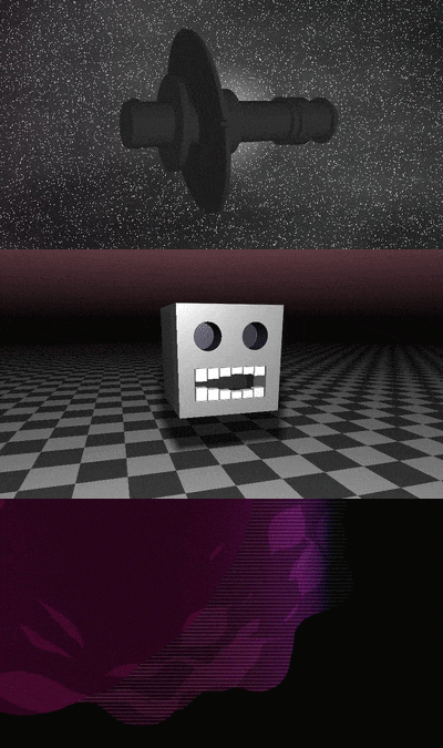
The spaceship(?) scene was fairly empty and a bit out of place especially when it's had no texture and was fairly static. When the ship shaked the scene became ridiculous since there was no rhyme or reason for it. And may have been the reason why this production didn't do as well as it should've.
I kinda liked the stairs. Some variation to it would've helped, dunno what. Reminded me a lot of some unknown 64k from around 2000. Tunnels are just way overused nowdays so the tunnel(I'm guilty on this too) scene didn't really interest me too much.
The bouncing blockhead really made this demo rememberable. Scene stood out from everything else and maybe you should've placed it more to the end of the demo. The next effect(I don't have a name for it) might have been better with a background but it was too shortly on the screen so I cannot be absolutely sure on this. Ok plasma.
This should've placed in the top 3 like noby already said.
Forgot my motivational thumb up. Keep improving.
nice
submit changes
if this prod is a fake, some info is false or the download link is broken,
do not post about it in the comments, it will get lost.
instead, click here !
