|
Study 1: Applications Of Rectangular Depth by Experimental Graphics Research Group
[nfo]
|
||||||||||||||
|---|---|---|---|---|---|---|---|---|---|---|---|---|---|---|

|
|
|||||||||||||
|
popularity : 59% |
|||||||||||||
alltime top: #16879 |
|
|||||||||||||
| added on the 2013-03-02 23:33:52 by MuffinHop |
||||||||||||||
popularity helper
comments
broken archive?
added on the 2013-03-02 23:49:36 by wysiwtf 
yep works now.
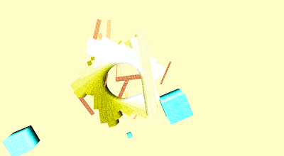
the fx/objects are too simple in my eyes, but still a thumb for the art factor and the nice ambient soundtrack.
the fx/objects are too simple in my eyes, but still a thumb for the art factor and the nice ambient soundtrack.
pls, study harder next time
thumb for atmosphere, and ambient music
nice and smooth
some nice moments. good effort.
Have a split opinion about this one, I like the visuals and the music - but somehow not combined.
Music is quite calm, free from distortion and feels slick but yet deep - for me this clashes with they noisy visuals, which tell a totally different story - they just don't seem to connect to each other.
That said, I don't know whether this was done in three weeks or three days - and the parts themselves are quite likeable,- good enough :)
eyecancer
would have worked for me with gray/dark colors + dark background because of the nice quite dark ambientish soundtrack. would have been a piggie but here is a motivational thumb for study 2 ;)
Overally a good demo but it feels slightly random/unfinished here and there.
meh
Interesting! Have you been inspired by the works of Walter Ruttmann or Oskar Fischinger?
forgot my thumb up!
Captivating.
@Branch: For the connection problem I had earlier,- what helps me is to listen to the music I got for a couple of times - and get a feel for it. You did already good by not moving much a lot very fast, though - get the drift what the person who did the music might see - or intended to "paint" - maybe even ask what they felt/did when doing their huge part of the demo. Then, close your eyes - and with the tools you have at hand, do your interpretation of what you hear.
Once again, I feel you did good here, but meh - both visuals and audio don't connect for me, yet. My approach might be too artsy, and I sometimes don't follow along it every time - but it might help you?
Once again, I feel you did good here, but meh - both visuals and audio don't connect for me, yet. My approach might be too artsy, and I sometimes don't follow along it every time - but it might help you?
Quote:
Experimental Graphics Research Group doesn't make demos, they're art pieces in form of a demo.
Love you for that :D
And yeah, each on their own they're cool, but for me (I mean it, only me - anyone else will and should see that differently) they don't connect like magnet should do, or at least uplift each other. I really, really look forward to your next demo - as I like the approach a lot, demos can be (and for me should be) art.
Branch, I get your point of no cuts - which is a odd coincidence as I just saw Rope for the first time which also has no obvious visual cuts( Hitchcok did trick a bit). However, it wouldn't fix it for me - as I said earlier it's more that the visual noise doesn't click to the music, or vice versa - apart from that it fits - as it's slowly paced and clean.
Now, let's stop talking and start making art :3
Artsy fantsy
Explains your thinking :3
nice colours! a bit different than usual demoscene pop colour schemes.
good music too.
good music too.
Meh.
cant say i agree with the colorscheme and simple objects fitting the sound.
but the mood of the music and the camera direction were pretty dope, thumb for that.
but the mood of the music and the camera direction were pretty dope, thumb for that.
submit changes
if this prod is a fake, some info is false or the download link is broken,
do not post about it in the comments, it will get lost.
instead, click here !
