|
Less is Less - Up Rough is More by Up Rough [web]
[nfo]
|
||||||||||||||
|---|---|---|---|---|---|---|---|---|---|---|---|---|---|---|

|
|
|||||||||||||
|
popularity : 58% |
|||||||||||||
alltime top: #20574 |
|
|||||||||||||
|
||||||||||||||
| added on the 2008-07-01 01:33:15 by spotUP |
||||||||||||||
popularity helper
comments
added on the 2008-07-01 20:03:50 by Bobic 
Nice and chill tune. Needs less Topaz :)
For the tune.
For the 64k.
Nice tune
Tune is okay, the rest is not.
love it.
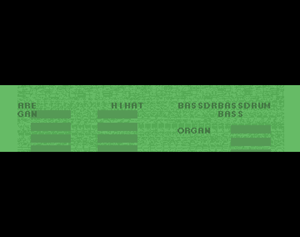
stripe, bouncing, some words scrolling by, breakbeat music, randomized pixels, VU-meter
love this beat, m-twang throwin' down in style, bigups to the uprough massive.
Groovy music.
Rest is just VU-meters and instrument names. This concept could work in a music-disk.
Rest is just VU-meters and instrument names. This concept could work in a music-disk.
submit changes
if this prod is a fake, some info is false or the download link is broken,
do not post about it in the comments, it will get lost.
instead, click here !
