|
A Simple Way by Vantage [web]
[nfo]
|
||||||||||||||
|---|---|---|---|---|---|---|---|---|---|---|---|---|---|---|

|
|
|||||||||||||
|
popularity : 64% |
|||||||||||||
alltime top: #9229 |
|
|||||||||||||
| added on the 2000-08-13 10:35:15 by lord k |
||||||||||||||
popularity helper
comments
This is a nice demo, with a simple theme :), but they can do better.
added on the 2000-09-16 22:38:30 by jb 
vantage did a nice step forward with that production. so clean. of course, everything looks a little "déjà vu", but i can only recommend you to watch this one, to discover a promising group. (yes, there's a swiss demoscene ;)
"simple" is not always a synonym of "sterile" and "boring". sadly, in this demo, sometimes it is. still, that's an idead I'd like to steal. 8)
a little bit empty blue demo
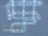
cold colors and flat 3d + wireframes scenes
not a must but a not bad demo, well designed
cold colors and flat 3d + wireframes scenes
not a must but a not bad demo, well designed
*yawn*
*yawn*
Hop, rating :)
Nice design and some nice effects, but the music is not as good. Maybe some not-too-simple music would had been better.
But overall a pretty good demo, in just 918 kilobytes.
But overall a pretty good demo, in just 918 kilobytes.
lil design... but stylish at least the music 8)_
I like it very much... Pretty relaxing and simple (read: pure).
It wasn't exactly bad, but there are dozens of demos like this. I agree about it being sterile and somewhat boring. Also, I don't want to see any more prods where cubes are arranged to form a bigger cube which is then rotated. It's just so dull.
didn't really like it. Incoherent music (it had some very nice elements in it but they were spoiled w. really stupid stuff and a chaotic [in a bad way] structure), boring wannabe-trendy gfx, no real design and worst of all, lame scenepoetry. But it didn't suck completely so i'll give it just a pig.
I agree with uncle-x, but I'd add that it bored me to death
Release was in Buenzli 2000 DemoCompo.
Ranked 1
Ranked 1
simple but i enjoyed watching. more then a stupid flybye
too simple
Boring. Bad. Lukewarm. Blergh.
There's no actual story but I still like this demo quite a lot. The music is cool and fits in the relaxing atmosphere of machine-like forward-movement.
Your way, what a simple relaxing way it is =)
Your way, what a simple relaxing way it is =)
Oh man! This is waste of GPU power :(
i quite liked it the time it was released :)
nice clean nu-school intro with wonderful relaxing music and mood
Well, your way looks great and sounds even better.
It gets boring in most scenes, though I like a bit some wireframe fractal shapes out there :)
Nice music and design.
But - oh no! Cheesy scene poetry!!!
"We like our way. It is simple."
But - oh no! Cheesy scene poetry!!!
"We like our way. It is simple."
Relaxing and nice demo
Incoherent, way too long and horrible camerapaths, but liked the fact it looked lightwave preview :D
quite appealing
Simple!
submit changes
if this prod is a fake, some info is false or the download link is broken,
do not post about it in the comments, it will get lost.
instead, click here !
