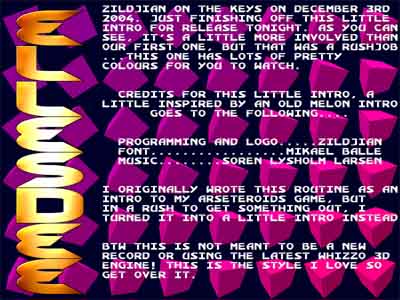
| esd intro 02 by Ellesdee [web] | ||||||||
|---|---|---|---|---|---|---|---|---|

|
|
|||||||
|
popularity : 62% |
|||||||
alltime top: #53573 |
|
|||||||
| added on the 2004-12-03 18:47:04 by darkus |
||||||||
popularity helper
comments
2nd intro from the uk demo group ellesdee.
added on the 2004-12-03 18:51:54 by darkus 
I miss the days when people release simple intros like this every other day just for kicks (and swapper/trader fodder).. Yes, this could be better in a lot of ways. But it could be a lot worse too.
yeah i know exactly what you mean
- this intro runs at 20 fps on my pc (1.7mhz)
- almost the same one ran at 50 fps on my Amiga (7mhz)
congratulations...
- almost the same one ran at 50 fps on my Amiga (7mhz)
congratulations...
Fans of fudged insanity, are we?
If I want a copy of a 1992-amiga-style intro, I'll download said intro. Message intros are great, but try some creativity like Equinox's last two intros.
If I want a copy of a 1992-amiga-style intro, I'll download said intro. Message intros are great, but try some creativity like Equinox's last two intros.
1.7ghz for the pc of course, my mistake :)
~25 fps here too. I wonder how you can achieve such terrible framerate with so few content.
Apparently, you don't seem to understand that one of the major rules of what you call "oldschool" was (apart from the mandatory touch of bad taste/lack of coherent design) to try to keep the displayed animations running at full framerate and this at all costs.
Apparently, you don't seem to understand that one of the major rules of what you call "oldschool" was (apart from the mandatory touch of bad taste/lack of coherent design) to try to keep the displayed animations running at full framerate and this at all costs.
wow. I like the nostalgia of it, but the code is POOR!
lol. Good old Pouet never fails to disappoint with it's piss miserable users
bla
It's not that we're miserable, but we're giving objective feedback on the intro:
Facts:
The code is slow, the idea is copied, there is no variation, the font is ripped and the filesize is huge considering what is shown.
Opinions:
The intro was boring, the design was below average, yet the music was pretty good.
My advice...stop letting the code restrict your ideas. Grab a popular demomaker instead.
please leave scene
This intro does not impress me, but I don't that was the idea anyhow.
"but I don't that was the idea anyhow" ?
the framerate is from the toilet² it stocks... until some frames are running again, what about testing it before on some different machines? else thank you for the work!
Erm.. it actually turns out that we have the wrong version available for download. Will be fixed shortly!
hey, i liked this, but people, variation! it would have been interesting then.. add more/change scrollers, more effects, change the background effect etc..
and do you have a framerate limit of 25 fps or something? it ran in 25 fps here, exactly, which seems a little weird..
darkus: i think he forgot the word "think" between "don't" and "that" ;)
and do you have a framerate limit of 25 fps or something? it ran in 25 fps here, exactly, which seems a little weird..
darkus: i think he forgot the word "think" between "don't" and "that" ;)
Thumbs up for getting it this slow with the use of a 3d accelerator
maybe they used the accelerator upsidedown? :P
Feels like the coder fell asleep on the keyboard and magically added a delay somewhere in the code
Well, i dont give it thumbs down since its homebrewn code and not some massproduced demotool thingie that looks like everything else.
Well, i dont give it thumbs down since its homebrewn code and not some massproduced demotool thingie that looks like everything else.
"you can press space to stop the scrool if you think its too fast" !?!?!?!?!?!?!?!!!!!
<3
fugdged insanity rules and this sucks. 400k?
Try reading my last post before passing any more judgement!
the colours are ok so i cant thumb it down
Slow. (cube got to much perspective imo)
Mmm,. it's ok. Didn't seemed much slow here, but I have a strong computer those days anyways.
Ran fine here. I suspect it was coded in something like blitz which can give bad results on some systems but I see nothing wrong with people keeping the old spirit alive.
Rotating cubes. Erm. Look, it's 2004.
erm... unimaginative and sloooooooooow
It's supposed to look this way ---old skool--- yeah! I
@TTDcoder:
Good shout brother!
Good shout brother!
ESD - the most entertaining thing to happen to worldwide demoscene since the Amiga! Rox!
ESD - the most entertaining thing to happen to the worldwide demoscene since the Amiga! Rox!
submit changes
if this prod is a fake, some info is false or the download link is broken,
do not post about it in the comments, it will get lost.
instead, click here !
