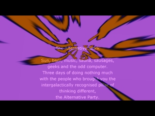
| The Alternative Stork 2004 Invitation by Numedia Cyclops [web] | ||||||||||
|---|---|---|---|---|---|---|---|---|---|---|

|
|
|||||||||
|
popularity : 61% |
|||||||||
alltime top: #53841 |
|
|||||||||
|
||||||||||
| added on the 2004-07-05 18:14:01 by DiamonDie |
||||||||||
popularity helper
comments
third invitation for this party, and none of them has "inviting" power.. maybe we need more mfx invitations? :)
it's informative enough for me.
Yes, what is this trend nowdays with 10mb invtros that don't run on more than half the PC's out there ?
40kb should be enough for everyone these days :-).
40kb should be enough for everyone these days :-).
UGLY
i hated the music and the effect of the background, in other words: everything of it
shadez: Or one by Moppi. :)
about the prod, I'm indifferent.
about the prod, I'm indifferent.
Navis: I'm reading this. But since only one production makes this trend so we've managed to do sth interesting ... and then It will be interesting to check the Symphony webpage ;).
And as for this one. It's really bad if it took You one year to do this. But maybe You're assembling your group so just a piggie from me :)
And as for this one. It's really bad if it took You one year to do this. But maybe You're assembling your group so just a piggie from me :)
bonzsaj : no offence, I must have got my numbers wrong - happens all the time !
The symphony 2004 would be a very nice stand-alone demo rather than invtro. Very graceful images there, but too slow for the majority of platforms I think.. But anyway, still looking forward to 'gently on my skin' final demo...
The symphony 2004 would be a very nice stand-alone demo rather than invtro. Very graceful images there, but too slow for the majority of platforms I think.. But anyway, still looking forward to 'gently on my skin' final demo...
did it take a year to make? not quite, more like a couple of hours ;P (and that was mainly to enter the scroll text).
and on reflection yeah, it did turn out quite ugly but ho hum, it's only a little invitation intro.
we'll make something better next time honest!!
and on reflection yeah, it did turn out quite ugly but ho hum, it's only a little invitation intro.
we'll make something better next time honest!!
Horrible music. I also felt that the inviting power was missing.
Annoying music, strange colors, boring effect. Sorry..
Sauna, sausages and geeks! Oh my, I'm getting all flustered now. Count me in! x
colors.
quality we have expected from this group..
Neat.
colors.music.code...alternative.
submit changes
if this prod is a fake, some info is false or the download link is broken,
do not post about it in the comments, it will get lost.
instead, click here !
